SEARCH 正在搜索内容,点击关闭继续浏览
false

“海语者”获A‘ Design Award金奖

“融创海逸长洲-海语者”荣获意大利A‘ Design Award金奖

意大利当地时间629日,一年一度的ADesign Award 颁奖典礼在古老的科莫小城隆重举行。来自世界各地的750名设计师、投资方、媒体制作人等齐聚著名的Teatro Sociale阿里斯科社会剧院,矗立在科莫湖畔的、建于十八世纪的剧院依然熠熠生辉,典礼现场红毯如茵、长裙拖曳,设计师们星光闪耀。


所有获奖的设计作品于Mood Museum of Design设计博物馆同期展出,随后将赴世界其他城市巡展。


ADesign Award 是世界领先的年度设计竞赛,是一项被国际平面设计协会结合会ICOGRADA欧洲设计协会BEDA所认可的国际赛事。其评审团由具有广泛国际影响力的业界学者,媒体工作者,创意设计专家,资深公司组成,经过慎重评估后投票产生得奖作品。2018-2019年度,来自180多个国家的设计作品竞相于99个不同的设计领域里竞相角逐,图石设计的作品“融创海逸长洲-海语者”最终获得建筑类金奖。

完整获奖案例,请移步:视觉系统-大连融创海逸长洲

得一提的是,阿里斯科社会剧院往东的马路对面就是是意大利建筑师朱塞佩·特拉尼Giuseppe Terragni最著名的作品之一法西斯宫,当然它现在的名字是特拉尼宫Palazzo Terragni,这栋1932年的现代建筑是意大利理性主义建筑的丰碑。


颁奖现场图片均来自A’Design主办方,特此致谢

项目:大连融创.海逸长洲

地址:辽宁大连

客户:融创华北区域

设计管理:徐迈,刘英彪,赵双伟,郭占坤,谷佳阳

设计公司:图石设计

设计团队:何杨、张睿、刘文波、张沛楠、高金笑、张琳娜、蒋旭慧

艺术指导:孙武

设计时间:2018.04

摄影:何杨、张沛楠

false

“御玺滨江-龙墙”获德国iF奖

慕尼黑当地时间2019315日晚,第76届德国iF设计奖颁奖典礼于慕尼黑BMW宝马世界隆重举行,图石设计师孙武、何杨、张睿因作品"万科御玺滨江-龙墙"获奖而应邀出席,与来自世界各地的获奖设计同行欢聚一堂,尽情欢畅,这也是图石设计历史上的第六个iF设计奖

iF首席执行官Ralph Wiegmann主持了颁奖仪式,为获奖者颁奖。来自设计、商业、文化和媒体等领域的超过2,000名参会者共同出席了这次设计界的顶级盛会。获奖公司的名单出现在现场的大型展墙上,世界各地的设计师们纷纷驻足拍照留念。颁奖典礼后,所有获奖作品将在德国汉堡iF设计中心展出。

创立于1954年的德国iF设计奖,是全球最大也最受认可的设计奖项之一,也被誉为设计界的奥斯卡。获得iF设计奖即拥有了国际公认的杰出设计标志,iF已经成为全球经济体系里设计关注者的一项重要指标。

以下为获奖案例图片

完整获奖案例,请移步:视觉系统-万科御玺滨江

项目:万科御玺滨江

地址: 湖北武汉

客户:武汉万科地产有限公司

设计管理:武汉万科设计部

设计公司:图石设计

设计团队:何杨、张睿、乐毅、高金笑、蒋旭慧、李雨涵

艺术指导:孙武

设计时间:2017.11

false

一袭春风一页诗

图石作品再获两项IF设计奖

慕尼黑当地时间201839日晚,第75届德国iF设计奖颁奖典礼于慕尼黑BMW宝马世界隆重举行,全球共有6402件设计作品参加了此次大赛评审,图石设计作品"万科中央公园风之树""2017建筑诗挂历"双双获奖。

iF首席执行官Ralph Wiegmann主持了颁奖仪式,为来自全球各地的获奖者颁奖。来自设计、商业、文化和媒体等领域的超过2,000名参会者共同出席了这次设计界的顶级盛会。获奖者的名单出现在现场的大型展墙上,世界各地的设计师们纷纷驻足拍照留念。颁奖典礼后,所有获奖作品将在德国汉堡iF设计中心展出。

创立于1954年的德国iF设计奖,是全球最大也最受认可的设计奖项之一,也被誉为设计界的奥斯卡。获得iF设计奖即拥有了国际公认的杰出设计标志,iF已经成为全球经济体系里设计关注者的一项重要指标。


ToThree was a winner of this year’s iF DESIGN AWARD, the world-renowned design prize. Our products The Tree of Wind and ARCH-Poetry Calendar won over the 63-member jury, made up of independent experts from all over the world among more than 6,400 entries from 54 countries in hopes of receiving the seal of quality.

Mr. Ralph Wiegmann, CEO of iF International Forum Design GmbH hosted the ceremony. Over 2000 guests from different fields, for instance, design, business, culture and media, presented this year’s gala. All the winners’ names were shown on the wall at reception, which attracted the designers to take pictures in front of it.

For 65 years, the iF DESIGN AWARD has been recognized as an arbiter of quality for exceptional design, and the iF label is renowned worldwide for outstanding design services. All awarded entries are featured on the iF WORLD DESIGN GUIDE, in the iF design app and displayed at the iF design exhibition Hamburg now.


万科中央公园“风之树”

万科中央公园地处合肥北城,是一片正在崛起的城市新区,如何在开放展示区里呈现出城市新区未来欣欣向荣的愿景,是本次设计任务的重中之重。我们利用风的特性,创造了一个具有独特视觉体验的大型风动装置-“风之树”,将项目的自然精神与文化内涵凝结成图腾,成为空旷场地上的景观对景与聚焦点,它为整个场地创造出庄重沉静又不失灵动的氛围。风拂树冠,枝叶光影交错,在精神上联结起中央公园大社区的各个部分,汇聚生长,也体现了人们在都市空间中寻求与自然和谐共生的人文精神。

The Tree of Wind

Vanke Central Park is located in the rising North Hefei, a city in the middle of China. How to demonstrate the thriving vision of the new area was the main challenge of this project.

We designed an installation for the open lawn area “The Tree of Wind”. It was shaped as a tree and driven by the wind, making it the totem extracted from its natural and cultural spirit. The eye-catching installation creates a unique visual experience and a peaceful yet dynamic atmosphere, making it the highlight of the whole environment. The leaves react to the natural light when the wind rises. They gather and grow, representing people’s pursuit to live harmoniously with nature within the city.


项目:万科中央公园

地址: 安徽合肥

客户:合肥万科地产有限公司

设计管理:任鹏飞、邹翔

设计公司:图石设计

艺术指导:孙武、何杨

设计团队:张睿、乐毅、张琳娜、高金笑、蒋旭慧

制作单位:天工标识制造厂、思想雕塑厂

设计时间:2017.05

摄影:何杨


2017建筑诗挂历

建筑诗挂历的灵感与设计语言来自于卡洛·斯卡帕,他的诗是以混凝土铸成的,时空序列交织在斑驳的印迹里。不同于当时的建筑主流,斯卡帕更倾心于历史悠久的威尼斯匠人的手工业传统,他一生的建筑实践始终贯穿着强烈的人文倾向与诗意气质。正是斯卡帕的这种手工工艺的情结,以及充满诗意的建筑表达,深深感染着我们,希望能在新年挂历的创作中,通过平面设计的方式,在纸本工艺的技术中传达出斯卡帕诗意的神韵。

我们用斯卡帕推崇的5.5x5.5的模数关系构成了从112的一组数字,并在构成关系的推敲中呼应着建筑传神的细节,这是建筑语言表现时间信息的一次有趣尝试。设计设想的模压工艺在纸张上击凸出三维实体,但如果起鼓的尺寸太小效果不强烈,而尺寸太大又会撕裂纸张,最终我们用精雕细刻的钢模和纤维强韧的木浆纸实现了预想的效果,而木浆纸特有的质感与色彩,朴素温暖,就像清水混凝土那样宁静安详,使得斯卡帕诗一般的建筑意境跃然纸上。最后在包装的选择上,我们选择了加长加厚的工业筒,可以更好的保护挂历的击凸效果。


项目:2017建筑诗挂历

出品:图石设计

设计时间:2016.11

印制:奇良海德

纸张:210克大地木浆纸

工艺:双色胶印、击凸、模切

画幅:420x594mm

包装:纸质工业筒


false

月湖来相照

图石作品再获德国红点奖

10月27日,一年一度的德国红点传达设计奖颁奖大典于柏林歌剧院如期举行,来自全球的1400多名设计师齐聚一堂,庆祝设计师的节日,我们因再次获奖而应邀出席典礼,而此次获奖的作品,正是近来广受好评的“月湖公园品牌+导示设计”。


我们需要特别感谢月湖公园项目的相关各方,首先是甲方碧源地产的设计管理团队,好的开始是成功的一半,他们对图石设计理念的理解与肯定非常可贵,其次要感谢施工方深圳卡乐板与西正标识所给予的通力合作。去年国庆假期赶工的夜晚令人难忘,甲方、乙方、施工方是一起在灯火通明的工厂里度过的...现在是收获的时刻了!

false

阿客人物专刊

孙武 | 他连续3年设计建筑师专属日历,今年更是让建筑“建”在了纸上

孙  武

图石设计公司总经理
“2015建筑师挂历”荣获德国“iF”设计奖
众多环境导示设计作品多次荣获
德国“iF”设计奖,德国“红点”传达设计奖,
德国国家设计奖等
建筑师应该拥有专属自己的日历。在这三年里,孙武团队的平面设计师们满足了建筑师追求个性化的愿望。2016年底,新推出的“2017建筑诗挂历(卡洛·斯卡帕专题)”再次大受欢迎,而他们早在2015年,就以一组“建筑师挂历”进入大家的视线,并在当年成功摘得有 “设计界的奥斯卡”之称的iF设计奖。这个有点特别的平面设计公司,平时专注于环境导示设计,与建筑有着不解之缘。
卡洛·斯卡帕的建筑诗
“我们是用斯卡帕的语言做的这个设计,
是对他作品的一个符号化的再现。”
威尼斯的光影和时间流转,穆拉诺岛上丰富的光线一点点推移,融入建筑空间之中,投射在半个世纪之后人们的墙壁上,投射在墙壁上一张挂历的数字之间,时间同时沁润过卡洛·斯卡帕的建筑表面。
这就是“2017建筑诗挂历”。一张简单的挂历,凝固着新的一年12个月的时间,也凝固着斯卡帕诸多建筑作品的经典元素,向斯卡帕大师致敬。
▼建筑诗挂历1月

▼建筑诗挂历2月

▼建筑诗挂历4月

▼建筑诗挂历8月

▼建筑诗挂历9月

在这个设计中,图形创意和建筑师的作品天衣无缝地结合在了一起。 “其实是我们对他的作品的一个符号化的再现。每个图形的设计都是有出处的。我们是用斯卡帕的语言做的这个设计。

5.5*5.5的模数语言,层叠装饰。每个数字形态的构成均来自斯卡帕的作品。所以这个主题是特别鲜明的。”比如数字8,借用斯卡帕经典的基督鱼符号。斯卡帕建筑中的褶皱形态装饰被很好地运用到数字图形中。

斯卡帕建筑中的基督鱼符号

卡洛·斯卡帕是一个很独特的建筑师,他的建筑被称为诗意的建筑,注重对细节的刻画和渲染,有丰富的材料运用。其建筑中的褶皱装饰常常作为隐喻和分割。路易斯康曾说,在他的作品中,美是第一感受,艺术是第一评论,而“形式”中蕴涵的意味让人惊叹。
斯卡帕建筑


2017的日历之所以采用平面海报而不是册页的形式,是孙武和他的团队细心考虑的结果。“因为纸张起鼓以后它就没法叠落了,一叠落就把它压平了,所以干脆摊平了做成一张大海报。”这恰恰也表明了他们从问题出发的设计思维方式。

▼2015建筑诗挂历

孙武说自己对斯卡帕的深入了解是比较晚的,是去年为一个设计项目收集参考资料时才开始发现并关注的,但孙武对建筑的情感却是从十几年前就慢慢扎根的。

环境导示是建筑设计的延伸
“其实回过头想想那段建筑经历给我的影响是决定性的”
学师范美术出身的孙武第一份工作是在建筑设计院描图,主要是画效果图和描施工图。虽然是枯燥的工作,却给了孙武决定性的影响。“那段经历给我一个积淀,虽然没有最终转变为一个建筑师,但是你耳濡目染也会留下很多东西。其实做设计不是教授出来的,主要是理解,认知和感悟。”
“但是我心里还是有一个做设计的梦。”出于自己做设计的愿望以及对建筑注册考试的敬畏,五年后孙武选择了平面设计行业。“平面设计一般人会觉得这个专业挺浅显的,门槛很低,好像谁都能做。但是我觉得这个专业恰恰是对美感的要求最高的一个专业。如果控制不了比例关系、色彩关系,对点、线、面以及它们背后的设计观念不敏感,你就干不了这个事,至少不能很高标准地完成设计任务。”而正是因为这段建筑工作经历的影响,孙武和他的团队逐渐选择了平面设计中与建筑关联最密切的环境导示专业方向。
▼德国红点奖作品“天津美术馆环境导示项目”

他们给自己的公司起名图石设计,英文名就叫Tothree,从二维到三维,to语音双关地表达出two这样一个环境信息、字体图形的graphic design 的本质,但他们希望这个设计成果放到三维空间里,放到建筑和城市里,是“信息场”的一个概念。环境信息设计本身是二维的,它从二维出发,但是当它投射在在建筑、城市空间里时,就转化成三维实体了。

▼图石办公室内景

工作中,建筑设计的经历也塑造了他们的思维方式。“我们信息设计的成果是在整个建筑和景观的大的语境里面呈现的,特别强调共生关系。我觉得这是我们的优势。在整个环境导示设计这个行业里其实能真正做到这一点并且做得好的公司其实并不多,大量的是加工制造企业的设计端,他们的设计方式是针对材料工艺、工程利润等等。而我们的工作是对建筑设计的一个延伸与补充,是把设计观念向着建筑更细微层面的推进。”

▼图石合影

“所有设计其实原理是相通的,只是尺度关系上不一样,但是比例关系,还有功能布局,空间穿插等,其实是一致的。”“因为你有志于此嘛,对这个专业有热情,我们这个团队正是因为这个文化才凝聚在一起的,密斯在巴塞罗那德国馆开幕的时候讲过一段话,有几个关键词叫做方法简明,意图清晰,思想开放,崇尚自由,这其实是我们推崇的设计哲学。”

藏在建筑中的数字
“我们想看看小建筑能够激发出什么样的东西来”
2015年第一本以建筑为主题的日历诞生于偶然。图石设计的办公环境是在北京方家胡同的一个创意大院里,邻近孔庙、国子监、雍和宫,文化氛围浓郁,周围全是四合院和特别有趣的胡同,浓荫密布,是个很能激发人思想和灵感的地方。
当时每隔两三个月院子里都会举办一个建筑微展,能看到众多知名建筑师的一些个性化作品。他们发现当代这拨年轻的建筑师已经从大规模的城市组团、地产开发等这些大项目里边跳脱出来了,专注于一些个性化、文化类的小尺度建筑。
▼图石办公室内景

“因为这种设计方式无疑会更接近于建筑学本源,所以我们就沉浸在这个氛围里,那段时间看了很多的这种微展,那我想我们要做一个这样的设计主题岂不是很好吗?我们就找很多经典的小建筑来看,我们想看看这个小建筑能够激发出什么样的灵感来。”

▼2015建筑师挂历(萨伏伊别墅)

很幸运,第一个灵感很快出现,它来自于最为经典的萨伏伊别墅,这也是他们第一个定型的设计。“我们就发现,唉,这不是有一个3嘛,这个3是否可以表示3月,那是不是可以找到1234567,是不是都可以找出来。”由此发端,第一本“2015建筑师挂历”便慢慢诞生了。

在寻找隐藏数字的过程中有一个有意思的现象,在最后选出的12个建筑中有5个都是安藤忠雄的作品,“安藤的最好用,因为他的建筑平面布局大多是几何形态的,空间穿插会很多,它就容易出这个造型。”为此,他们还特意给远在日本大阪的安藤寄去了一本挂历。“也不知道他收到没有,以后有机会就问问他......(笑)”
▼2015建筑师挂历(格瓦斯梅的住宅)

当时这个设计的反响很大,也受到多家媒体的关注。“我们第一次印刷就是我们自己用和给朋友、客户送的,只印了300本,但是后来影响大了,很多人来要,于是就加印,等寄出去以后不停的订单又来了,又加印,后来我们干脆就注册了一家微店,让专人来负责销售。最后算了一下,一共印了1300本。”

如果你够细心的话,还会发现藏在日历中的一些小幽默,比如5月1号这天标注的是“加班”。“劳动节不加班干嘛......(笑),因为设计师的五月通常会特别忙,五一常常加班嘛,那时候你会想,唉,今天不是过节嘛?后来想想,反正也是劳动节,那算了吧,还是加吧,我觉得设计师、建筑师大概都能明白这什么意思......(笑)”
设计寻根之旅
“心里无比的安宁,这就是自己梦想的地方,
我觉得就是这个心态。
自第一本建筑主题挂历之后,孙武团队每年都在延续这个系列。2016年的“从包豪斯到乌尔姆”就像一个总结回顾的旅后感,记录了团队2015年德国红点之行旅途中的点点滴滴。 “我们想起自己当年选择设计作为终身职业的时候,也曾矢志追寻包豪斯的理想,20年过去了,我们终于来到包豪斯,就像来还愿。”
孙武这样向我们解释“还愿”:“日本大作家井上靖,他年轻的时候开始幻想丝绸之路的故事,写出《天平之甍》、《楼兰》、《苍狼》、《敦煌》等名篇,但那个时候他还没来过中国西部,等到改革开放以后,他就已经很老了,他到敦煌来,就是他年轻时创想的那个环境,他睡在旅馆的房间里,空气中有沙尘悉悉索索降下来,他觉得无比幸福,心里无比的安宁啊,这就是自己梦想发端的地方,我觉得就是这个心态。”
2016设计寻根之旅——从包豪斯到乌尔姆

他还给我们讲起了图片背后的故事,“这是格罗皮乌斯的办公室的门把手,你把它拨开走进去,格罗皮乌斯就坐在那。”“包豪斯档案馆是格罗皮乌斯生前没有建成的,就是说我们看到的是格罗皮乌斯死不瞑目的一个项目。”“你们如果去Bauhaus的话,一定要去Kornhaus这家餐厅。这家餐厅太美了,在河边,一定要在那吃一顿饭,吃什么不重要,吃风景。”

制作的艰辛
“光制作就整整花了40天,每天打电话催”
看似简单的日历制作实际上有着不为人知的艰辛。比如最经历波折的2017建筑诗挂历,印刷产品由于涉及起鼓和镂空,在工艺上比较复杂,在制作生产中就遇到了挑战。“要把三维的模型给模具厂,先做一个钢冲压模,再把冲压模拿到印厂去在冲床上击凸起鼓。”
“原本那个印刷厂不给我们做了,因为不挣钱哈哈哈,量又少,要求又高, 印刷厂1000的话就算是很少了。”后来他们又找到盲文印刷厂,但盲文的书都很小,只有A3、A4的尺幅,而他们的挂历是A2尺寸。“另外呢,它起不了这么高。因为我现在做的0.9,0.6和0.3三个尺寸,单位是毫米哦,他给我的0.4,0.3跟0.2,虽然轻微但是我觉得差异也很大。”
最后辗转求助找到了一个朋友推荐的厂能做,在材料选纸上又遇到了问题。我们开始选那个纸不行,那个纸上去一下就破啊,纤维就断了,就试纸试了很多,这个东西压完了以后要照顾到纸纤维的柔韧程度,他要改变模型的细节,所以很多模型出来以后跟数字对不上,就是模切跟鼓起的部分对不上,就赶紧再调模切的刀版。费老劲了,最后做完了以后我就算了一下时间,光制作就整整花了40天,每天打电话催。”
2016建筑诗挂历包装壳

至此还没完,到制作包装画筒又有波折,“我想要包装跟内容拉开层次感,所以当时选择了一个专业的筒。画筒厚度和开启方式都比较轻巧,结果打样一寄到,压扁了。”包装这么轻易就被压扁,很明显不能保护挂历完好,孙武决定加厚筒壁,“这个筒呢,人家是装机械设备的筒,不是装图纸的,后来就发现它有点楞,跟那个海报之间的层次关系过了,但是我快递万无一失啊。”

每款日历从设计制作到批量生产都有自己的故事,孙武说只有当你具体做的时候才能遇到这些问题。虽然艰辛,孙武也乐在其中,“很多人到了这个时候就会问:哎?今年的出了没有,什么样,什么时候给我……我们办公室其实并不大,因为我们就十几个人,堆了一千个筒在那,进去以后大家都得跳着走。还有好多朋友是会来拿的嘛,出来后就开始打电话让他们来取了。”
为快递挂历忙碌

之所以每年都会选择建筑的主题,是因为孙武认为建筑学是人类文化的一支庞大体系,里边能挖掘出很多有意思的东西。“今年就是跟好多建筑师朋友讨论,到了10月以后,我就开始筹划这个事,因为有很多建筑师在问,所以我就问他们有没有好的设计概念可以提供,也是很多建筑师朋友一块讨论做这个的。”

孙武说,只要有人喜欢,他就有动力,当然首先是他自己有热情。从“建筑师”到“建筑诗”,他跟他的团队在对设计理想的追逐与坚持中日益成熟。于孙武来说,他也在二维的平面世界中始终用另一种视角保持着对三维的建筑文化的观照。
- END -
文字版权归阿客工坊所有
编辑整理:felyur+Fred
如需转载请联系阿客工坊
“与阿客同行”互动群已成立
欢迎添加微信号i_archer加入我们

false

Twilight in Rotis 2

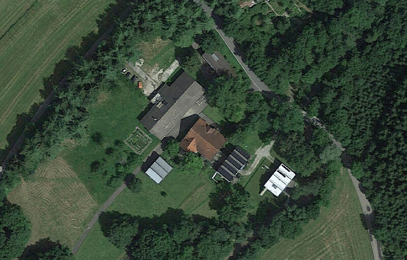
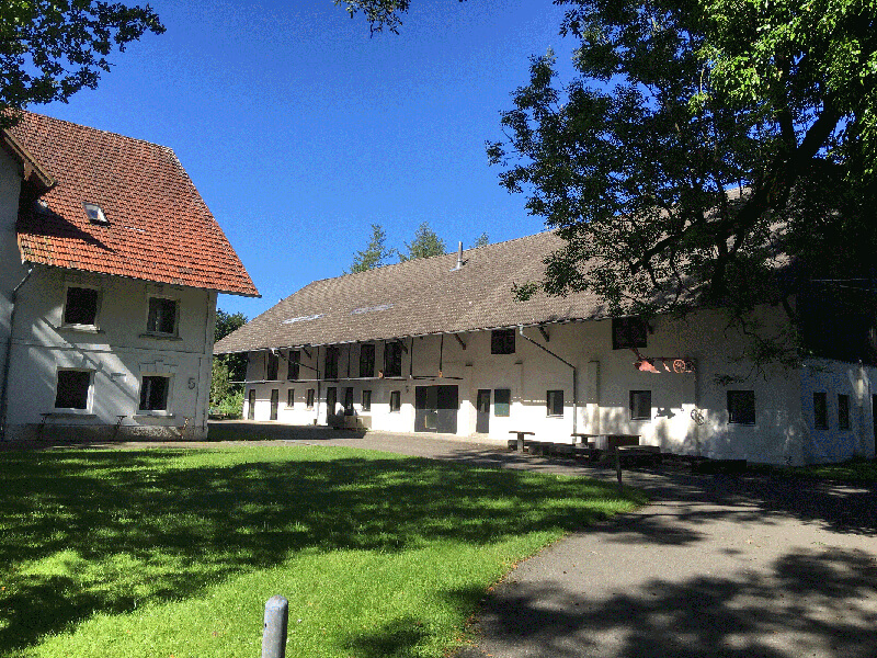
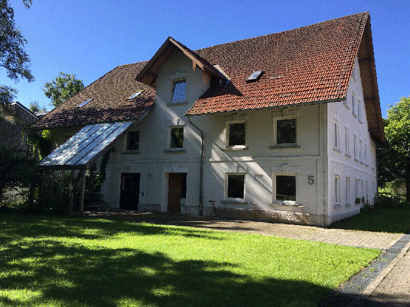
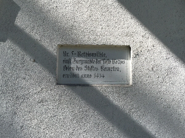
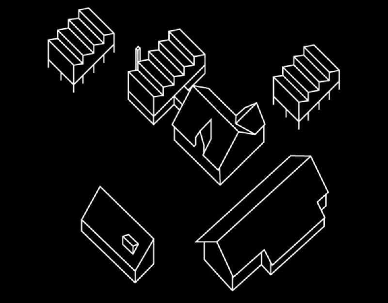
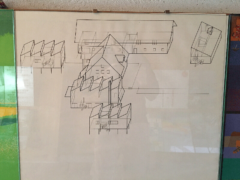
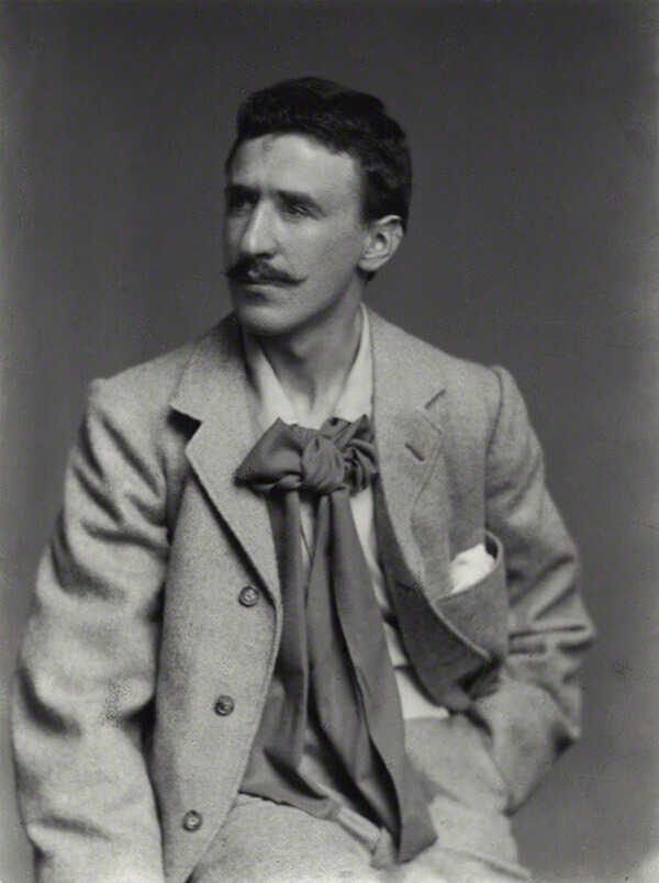
After HfG was closed, Aicher started thinking about having a design Utopia. In 1972, he passed through Rotis when working for the Olympics, and decided to buy this property and to build his Utopia here. He rebuilt and expanded the old mill, and added garage, cafeteria, dormitories, family house, as well as offices for his team, himself, font design, photography ect. 


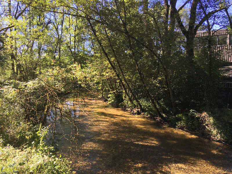
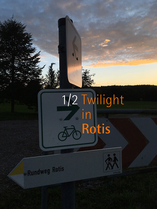
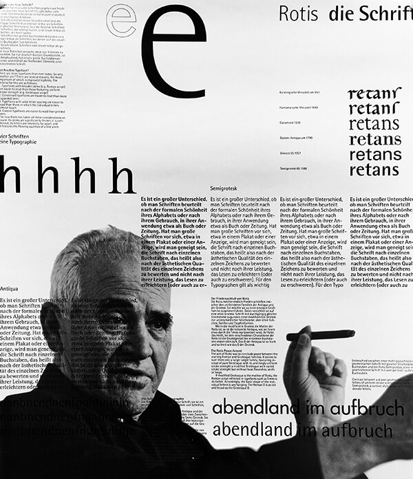
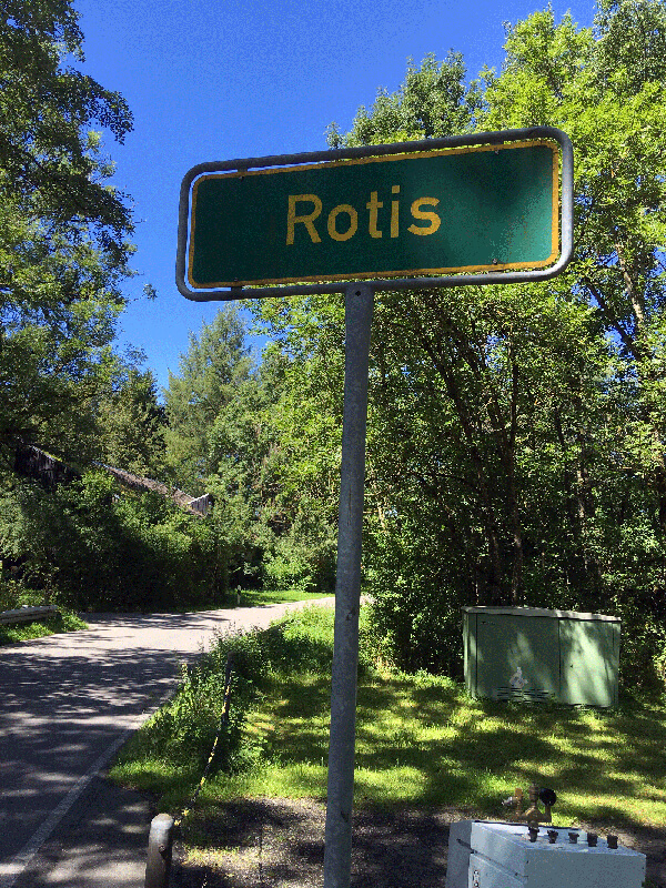
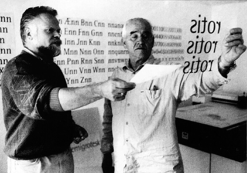
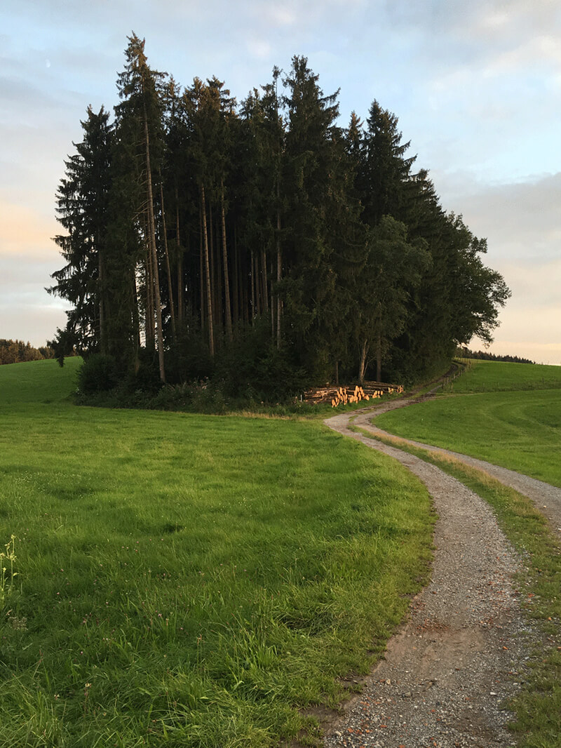
The winding creek went through the dense forest: the typical countryside scenery in Germany. That is how Rotis looked like in Aicher’s mind. He indulged in design in this peaceful place, and proudly named it Rotis Autonomy Republic. What confuses me is why Aicher didn’t design a logo for his Republic. I once joked that maybe because he could not afford the design fees. As a matter of fact, Aicher thought bigger apparently: he made Rotis a classic typeface and put it to thousands of designers’ font libraries, making it a more influential spirit and value: liberty and freedom in this complex world. 


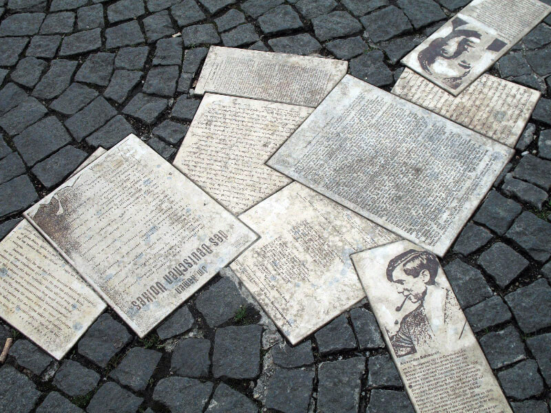
The design Aicher did for Isny, a small town near Rotis, reflects nature’s influence on design. The local people are still proud of the design and make it their souvenir.


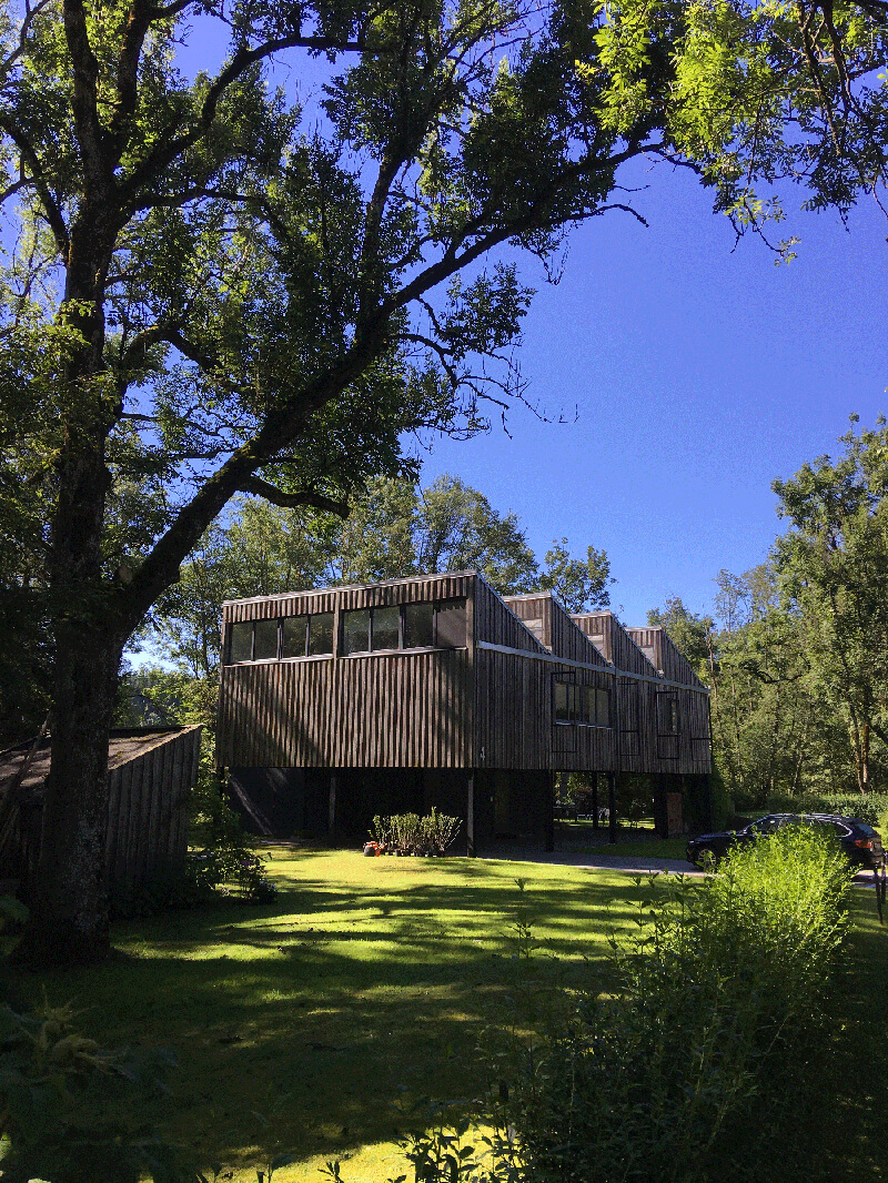
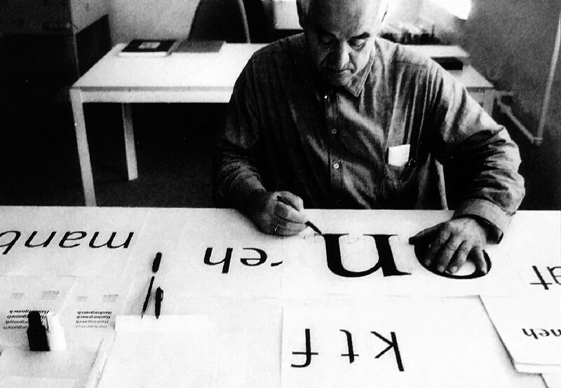
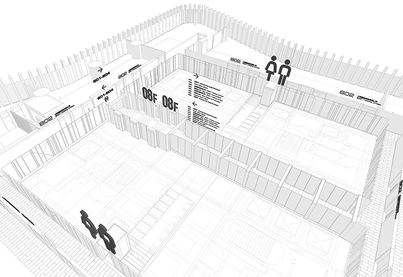
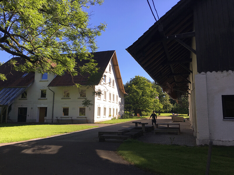
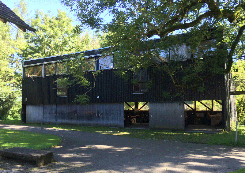
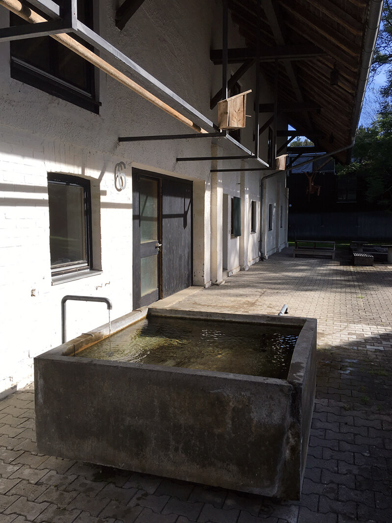
Back to the time without computers, design still required certain physical elements, such as sketch, drawing board, drawing tools etc. Therefore, Aicher set different design office according to different categories, which certainly required a lot of space.

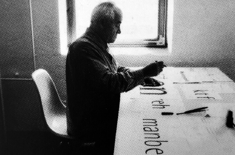
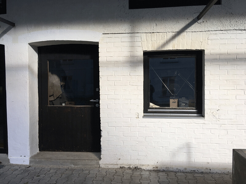
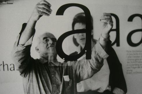
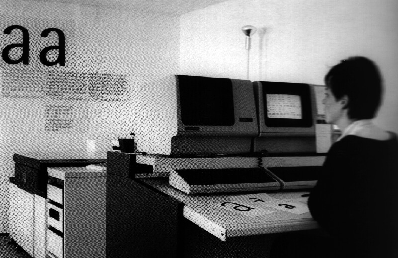
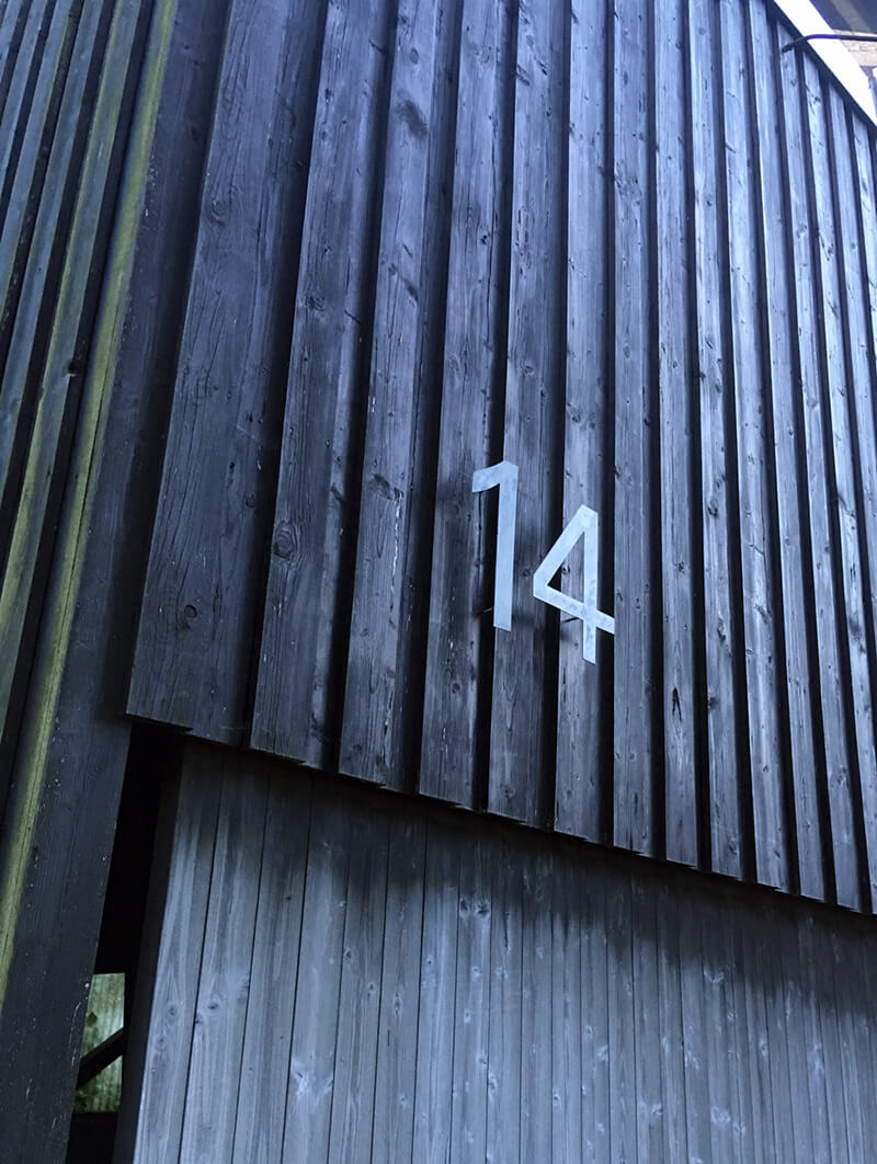
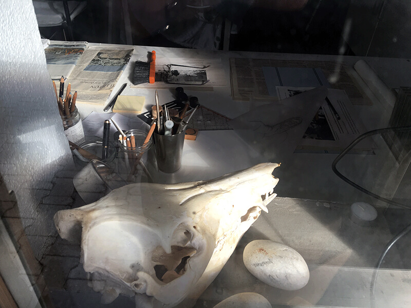
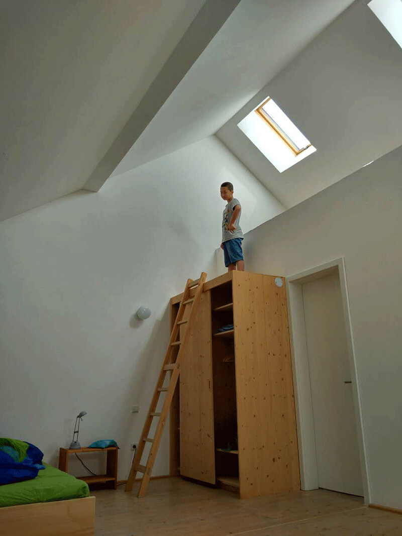
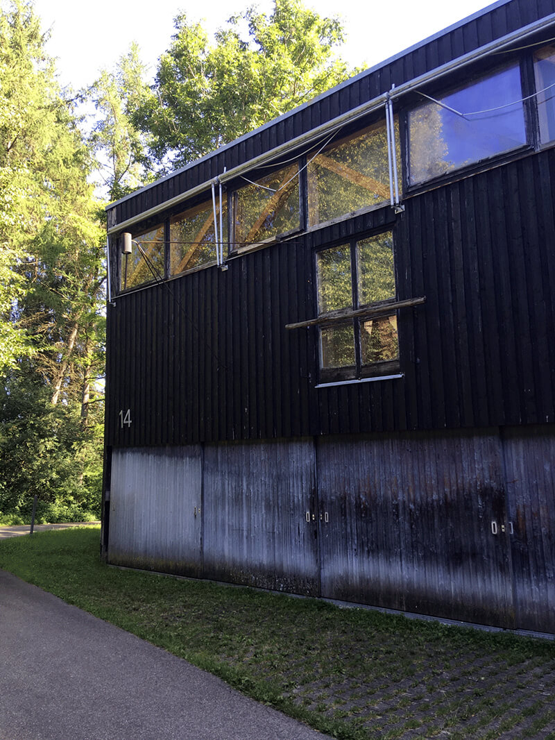
The room on the first floor of the garner was Otl Aicher’s Font Office. The window in the newly photographed picture is the one that Aicher once stand by in the old picture. Now we can only see the window.

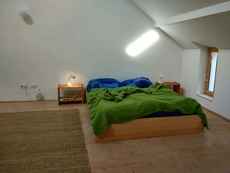
The guest room for visitors on the second floor of the Font Office, also converted from the garner, is spacious, comfortable and modern. The electricity used for bathing or cooking and everything in Rotis is photovoltaic. It is very convenient. 

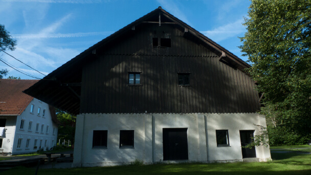
Florian Aicher, the Architect who redesigned the garner is the eldest son of Otl Aicher.


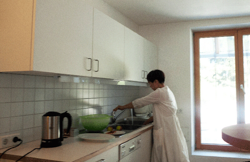
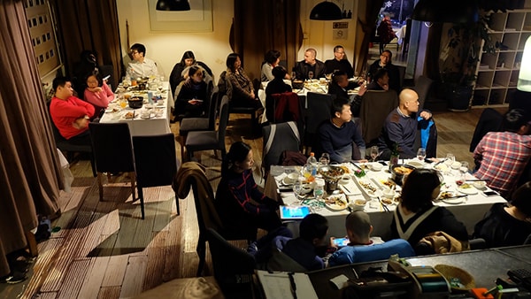
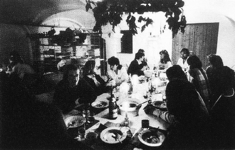
There were no commercial shops near Rotis, so we had to cook by ourselves.

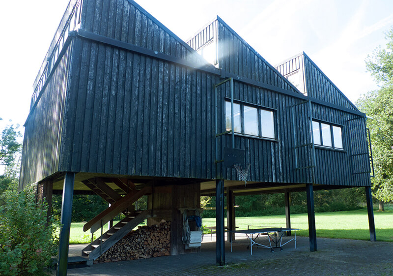
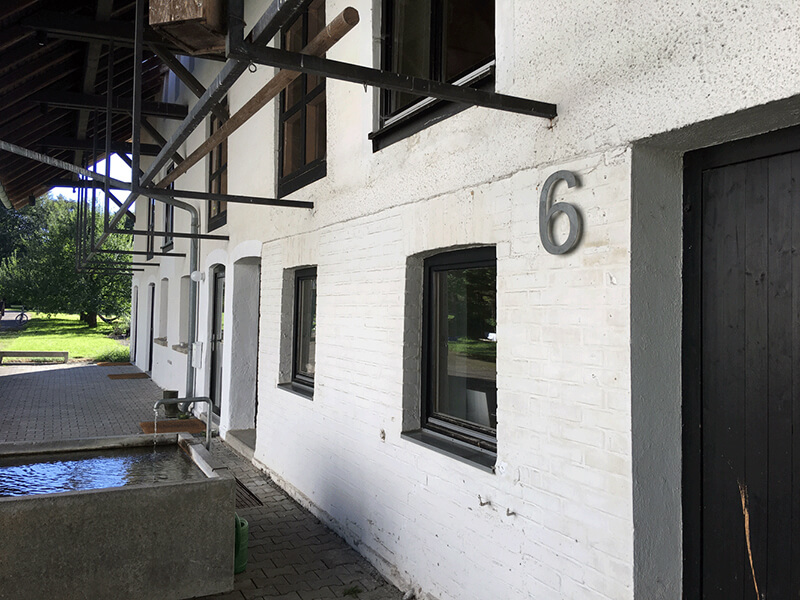
Aicher’s office on the second floor of the garage remained the same structure, only the wood of the stairs had rotten and the office is now used for other functions.

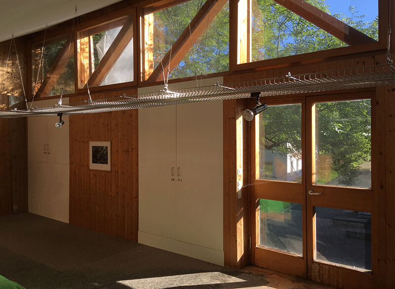
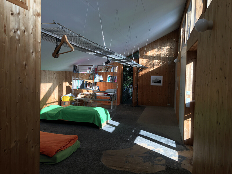
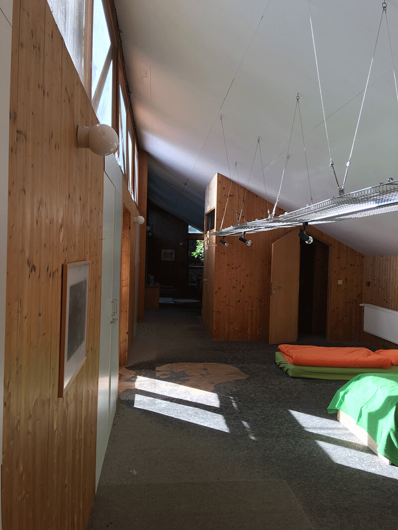
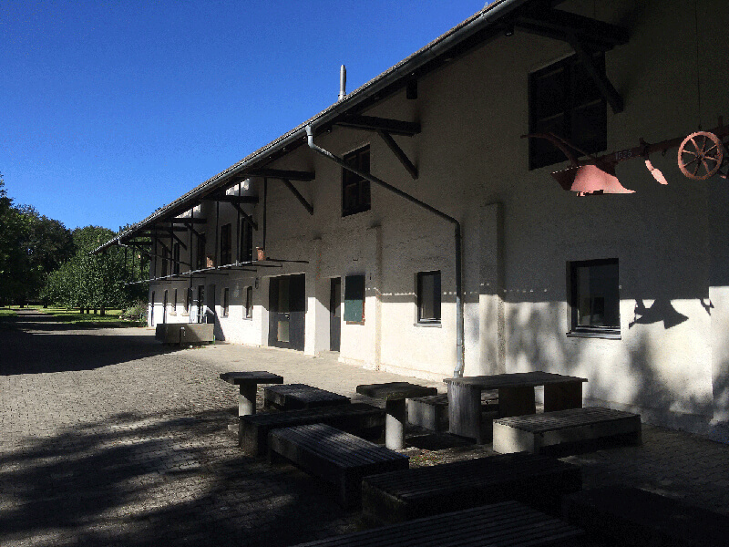
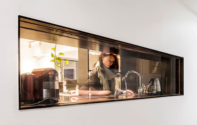
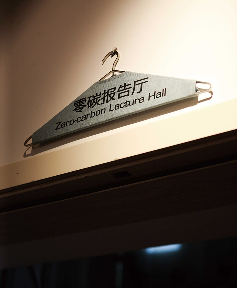
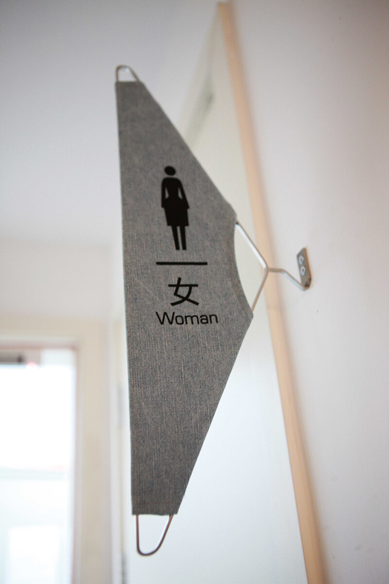
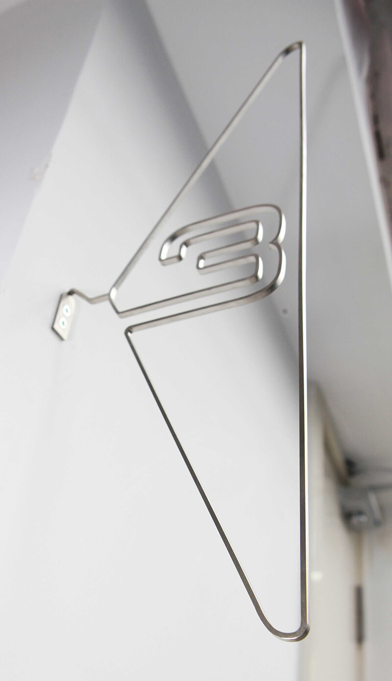
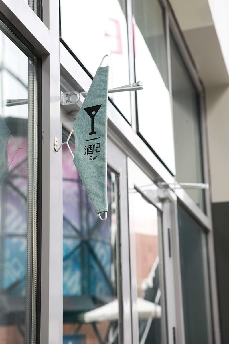
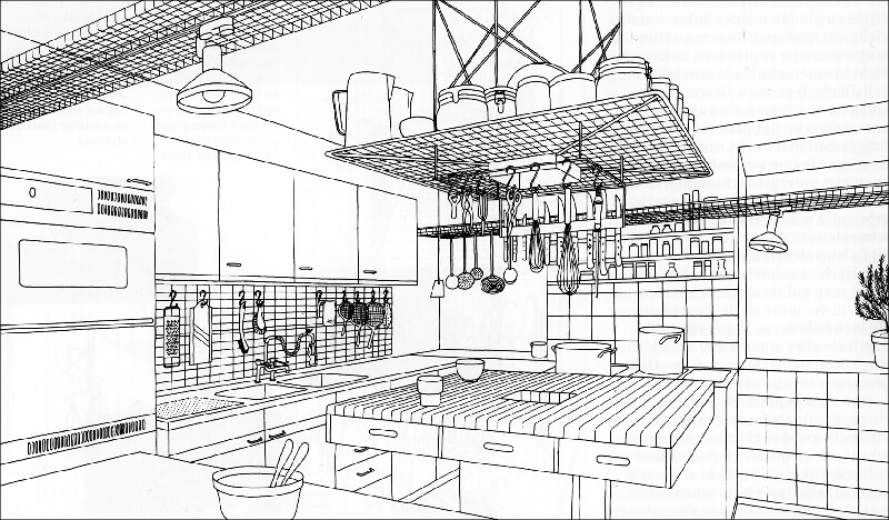
Inside the studio, the metal hanger attracted our attention instantly. It was one of Otl Aicher’s favorite designs, and can be used to install lighting for workbench or operating bench. It can also be used to contain books, tools and other things. The design of the open kitchen of Bulthaup developed the hanger further, and finally became an indispensible part of the modern kitchen design. It also shows Aicher’s capability in architect, product and graphic design.


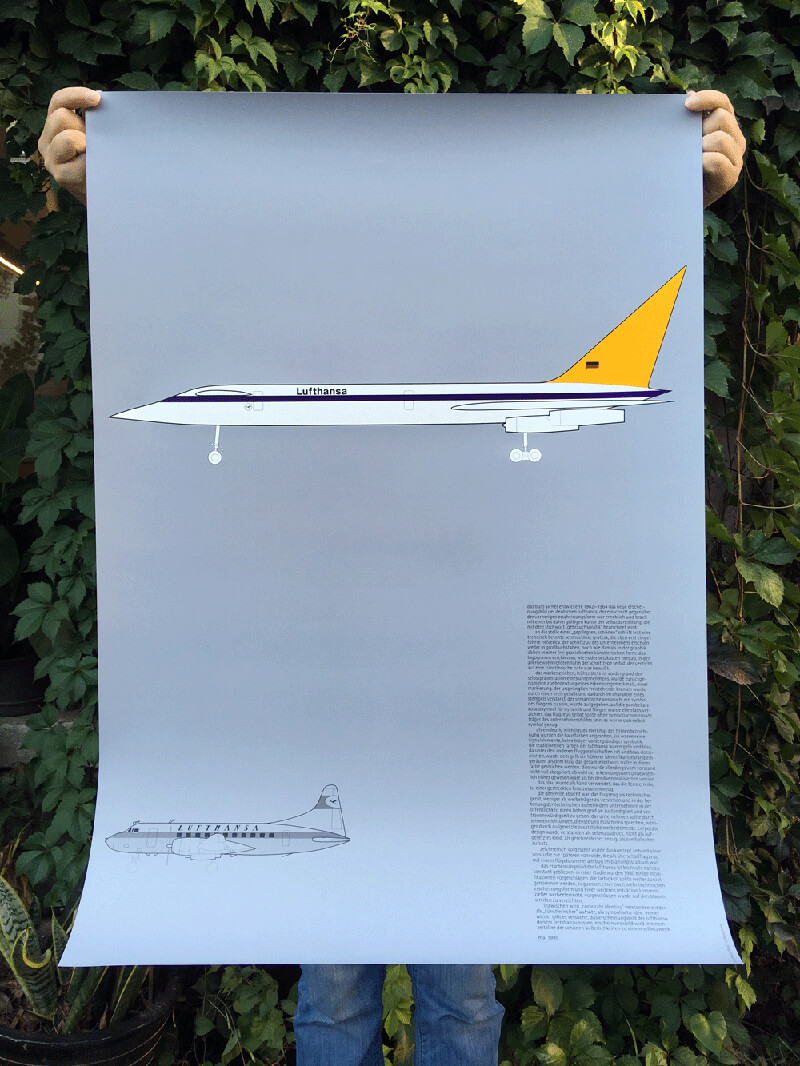
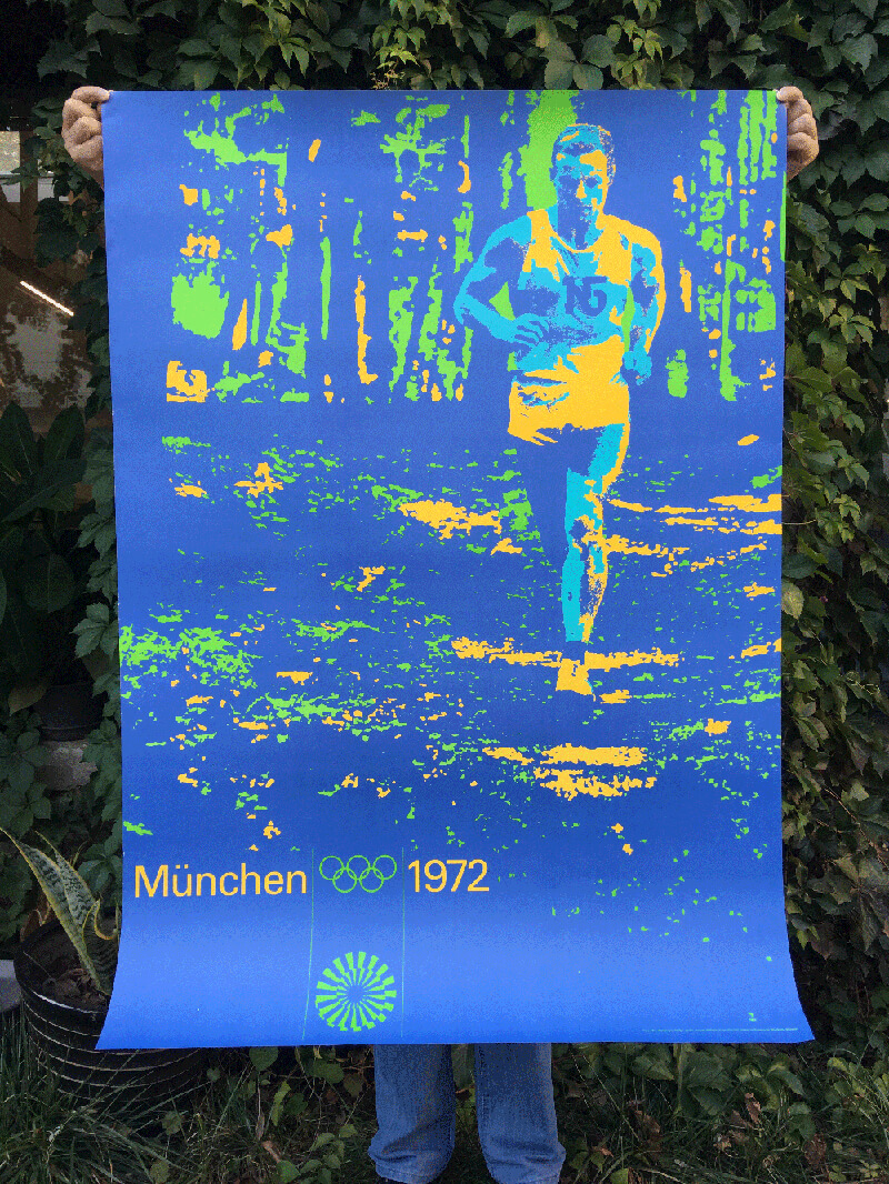
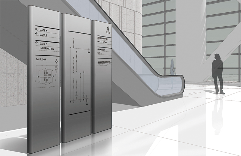
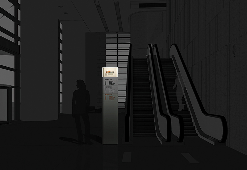
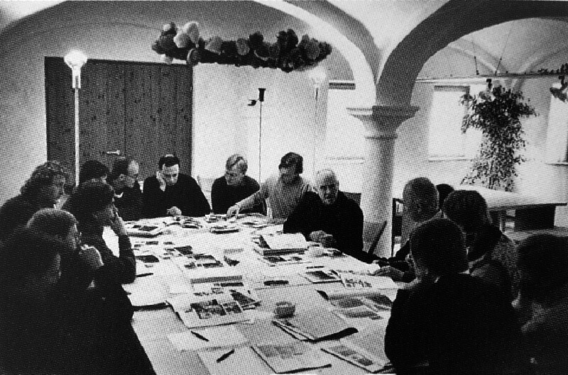
Though Rotis is quiet and away from the city, Otl Aicher and his team designed and created a number of important brand images, such as Bulthaup, ERCO, FSB etc. at the same time, they served the significant clients such as Lufthansa, Deutsch Bank, ZDF, BayWa and so on. It was so ambitious and strategic, that people of recent time cannot imagine how he managed it in that time without computers.


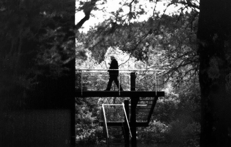
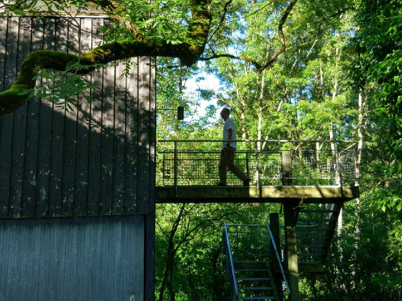
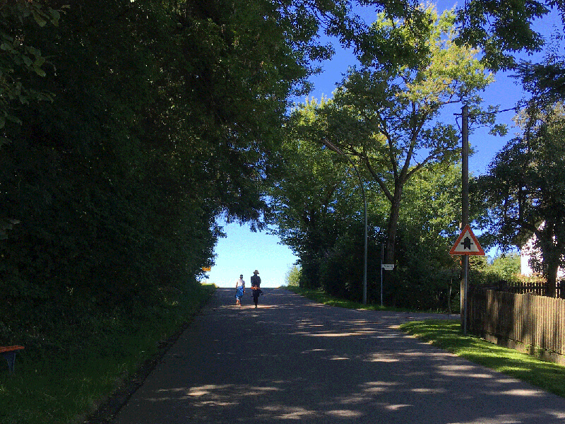
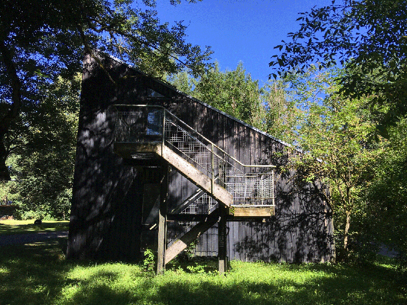
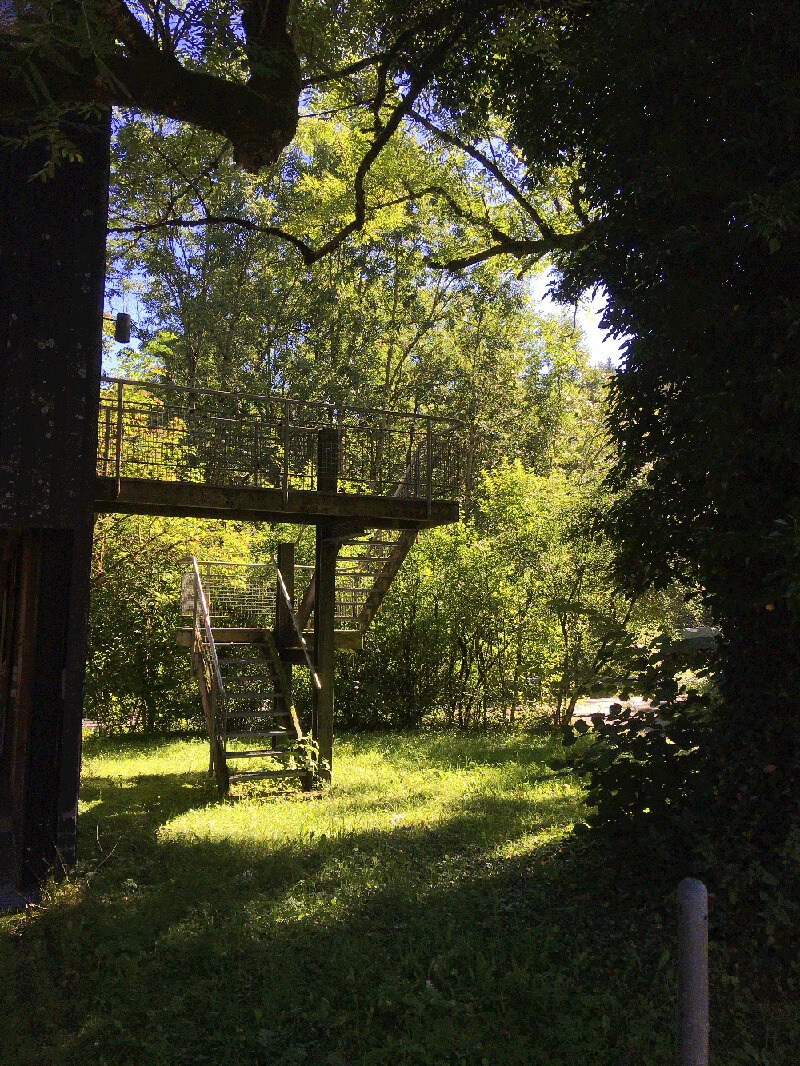
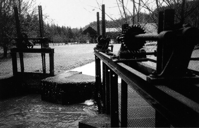
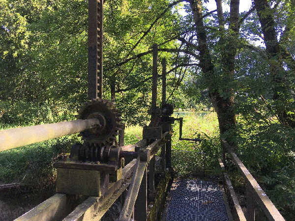
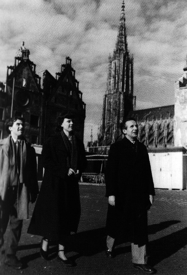
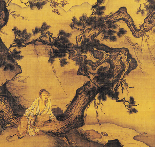
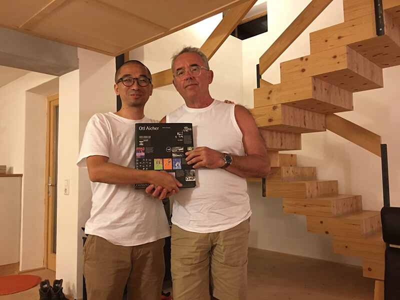
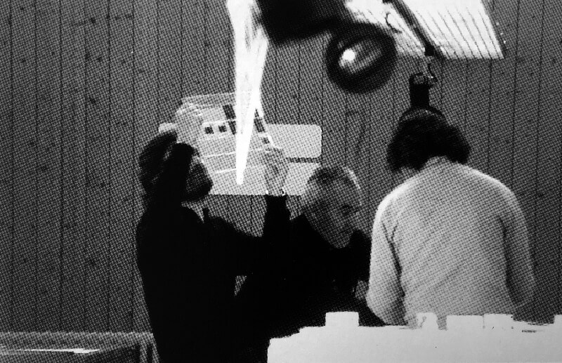
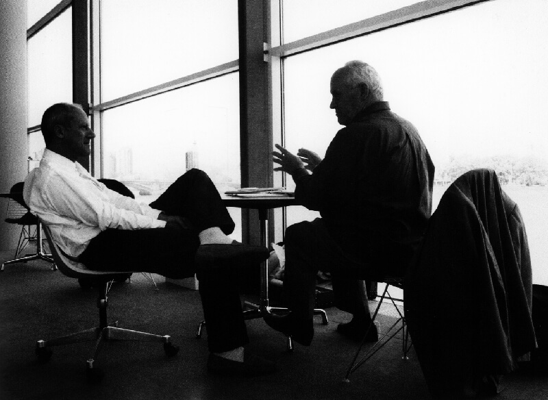
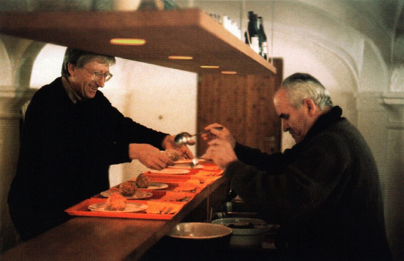
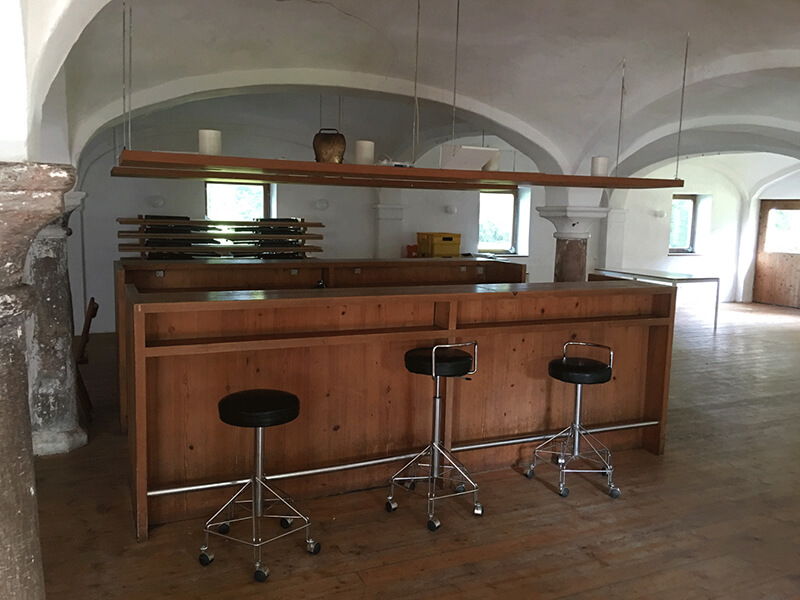
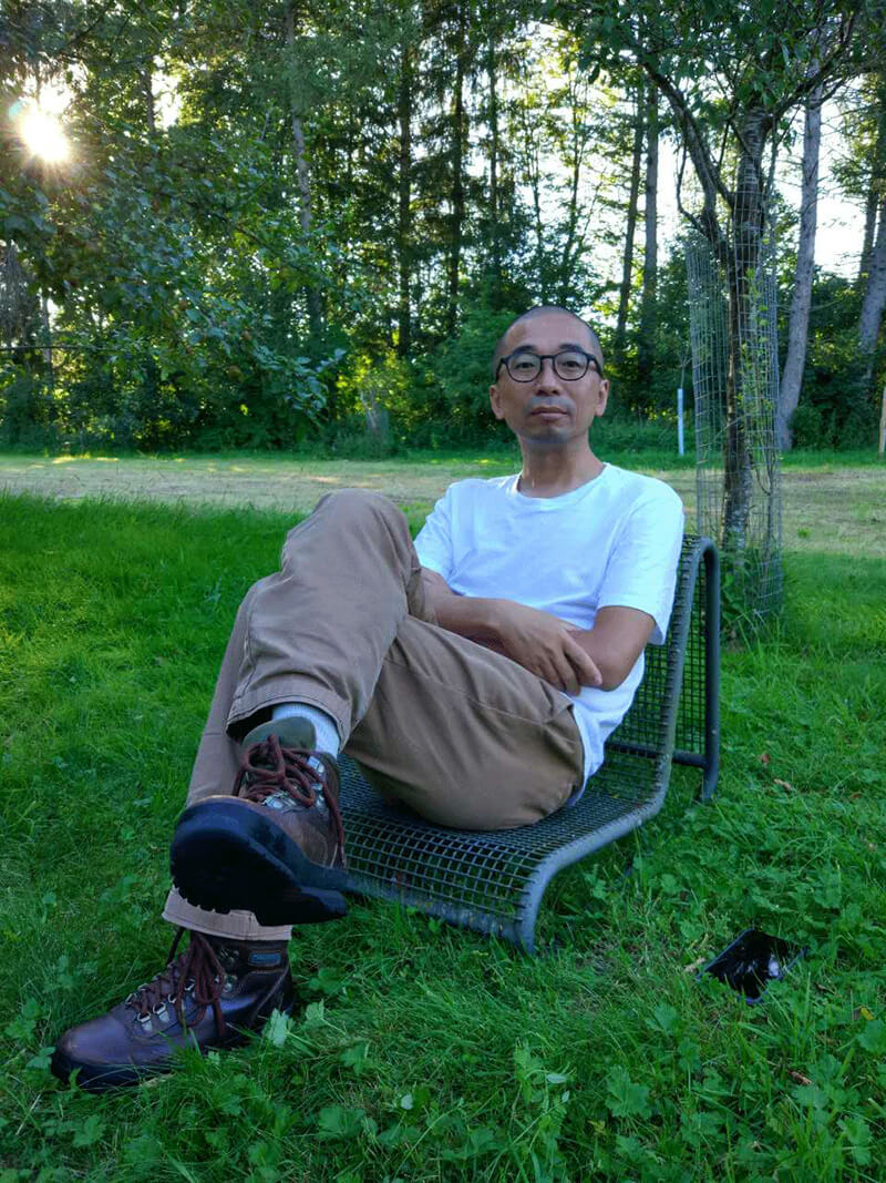
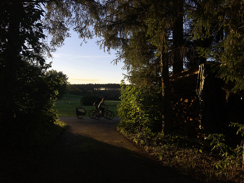
The similar scenes with a lapse of 30 years, and please note the branches over the two people’s heads.


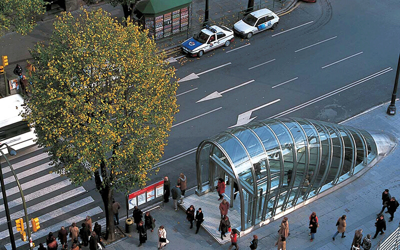
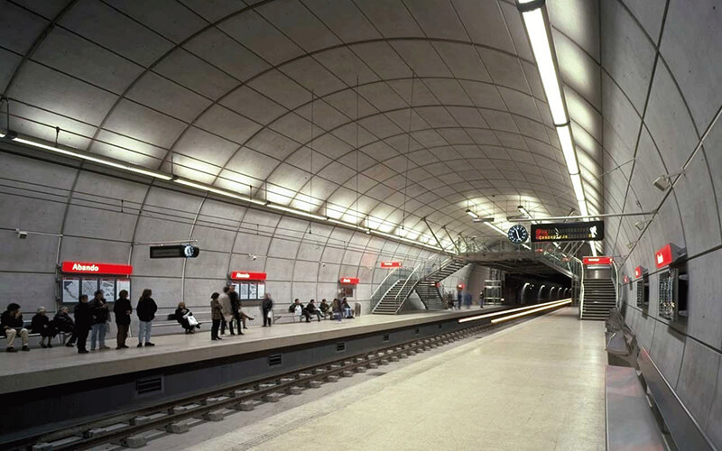
Back then, the big names in design and business industries gathered in Rotis, of whom, Norman Foster often flew from London to Rotis to talk about projects. The two masters cooperated in Bilbao Metro project, and Aicher was in charge of brand and environment design. 


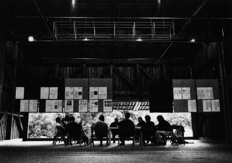
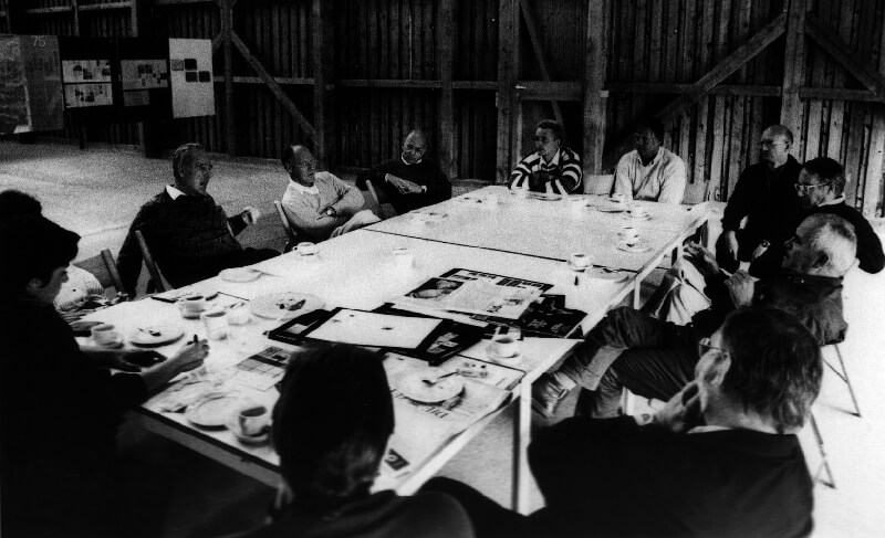
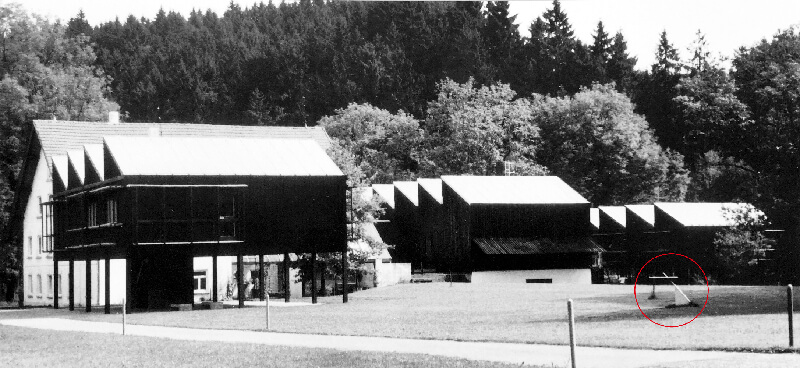
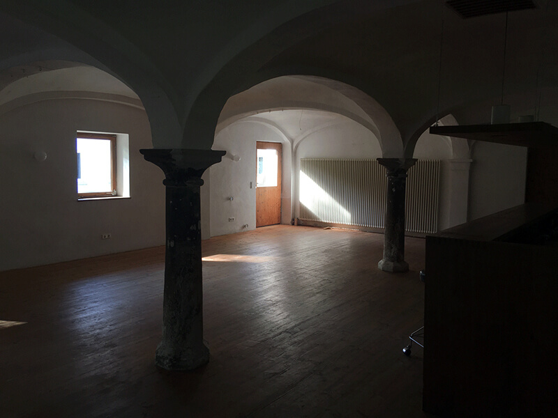
The old arch in the stable, which is east to the garner, is also the largest indoor space in Rotis. It was where the big names gathered and talked. You can almost hear their laughter and talking in this space now, even it is empty.


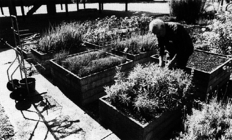
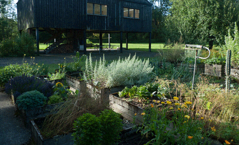
Otl Aicher liked gardening. He enjoyed the time as a gardener.


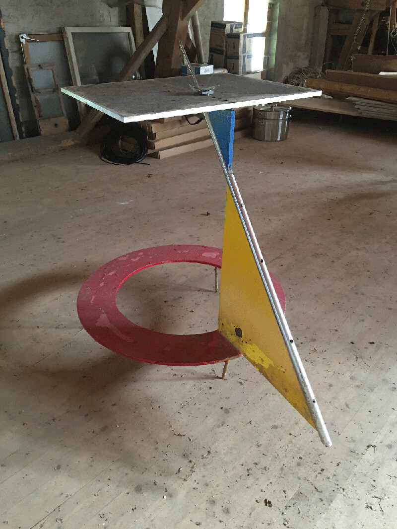
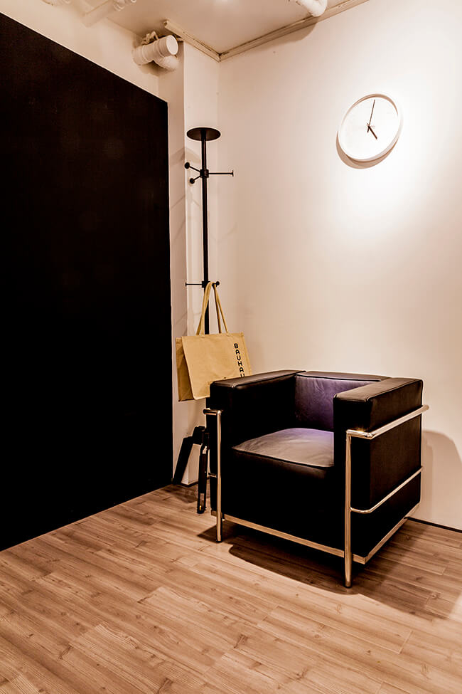
The chair designed by Aicher, is simple and comfortable. It had been imitated many times, and we only came to know this is the original after coming across it here.


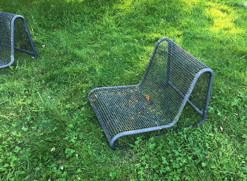
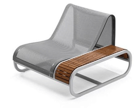
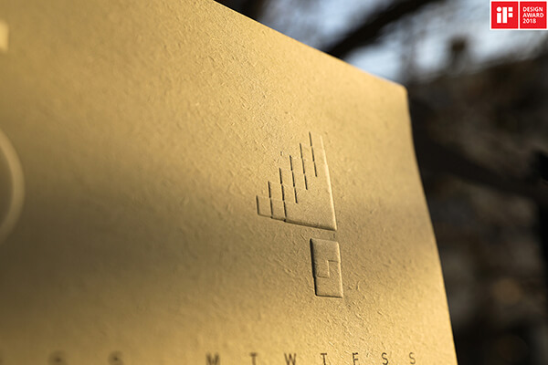
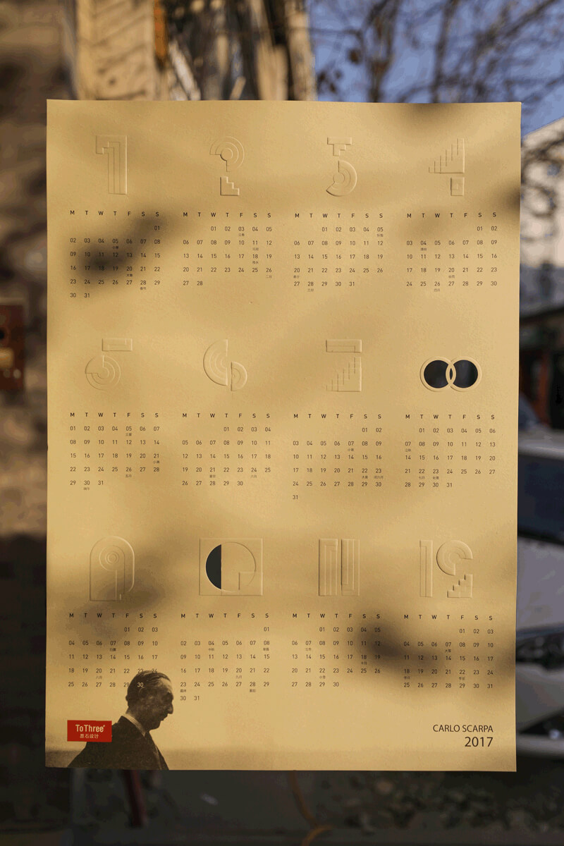
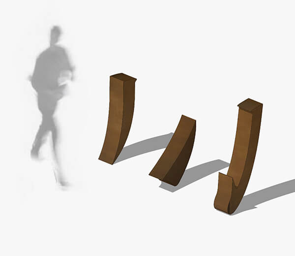
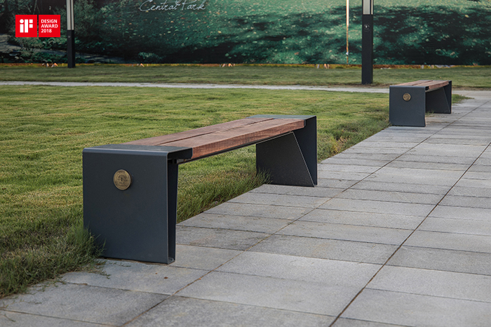
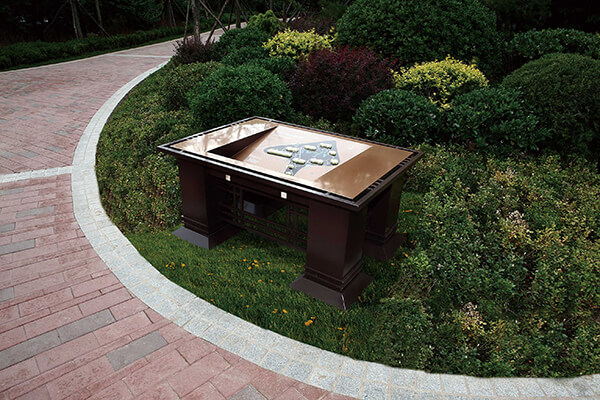
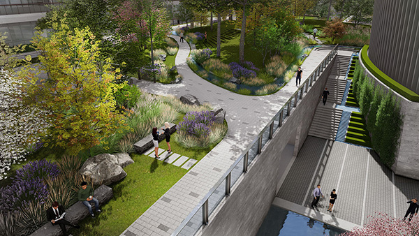
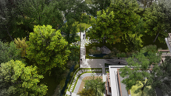
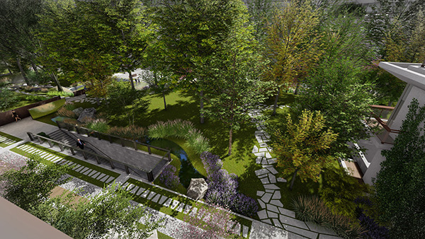
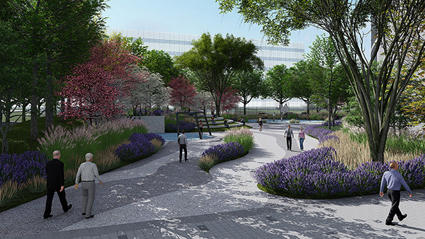
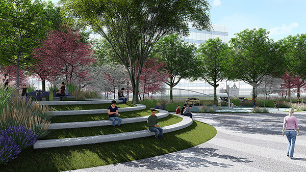
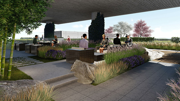
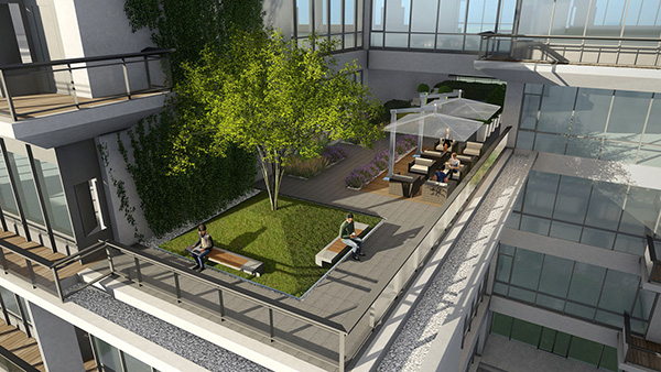
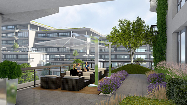
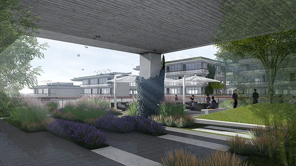
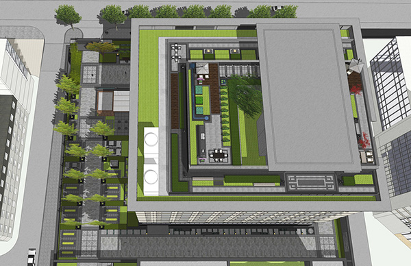
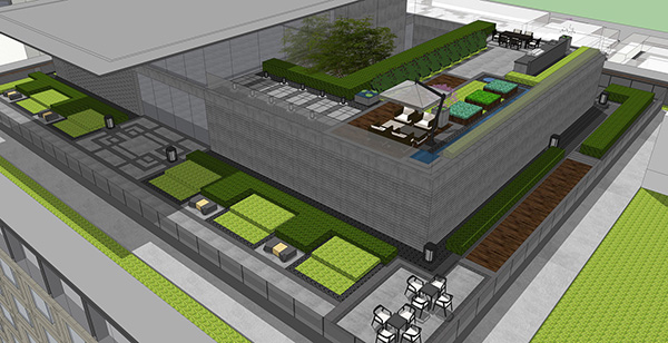
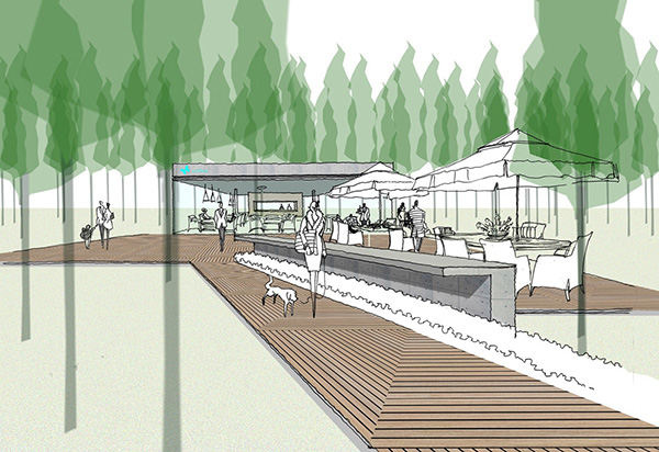
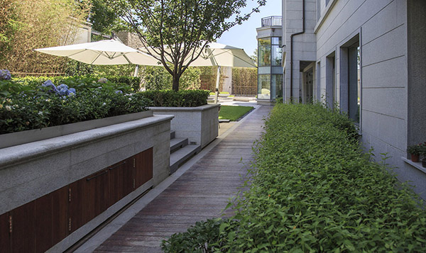
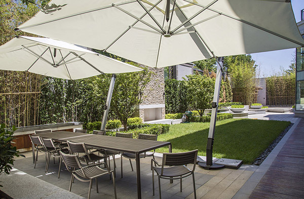
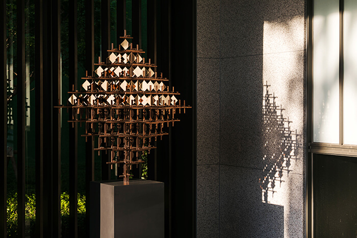
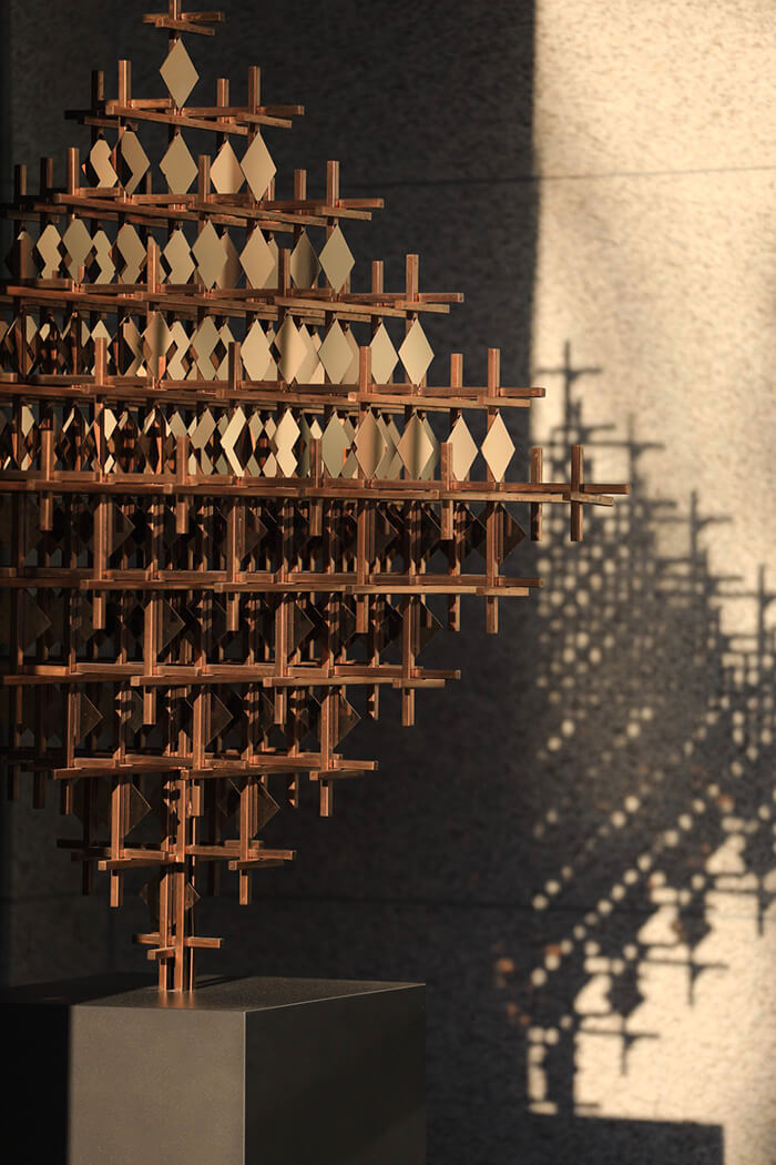
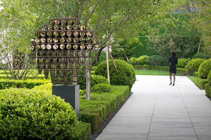
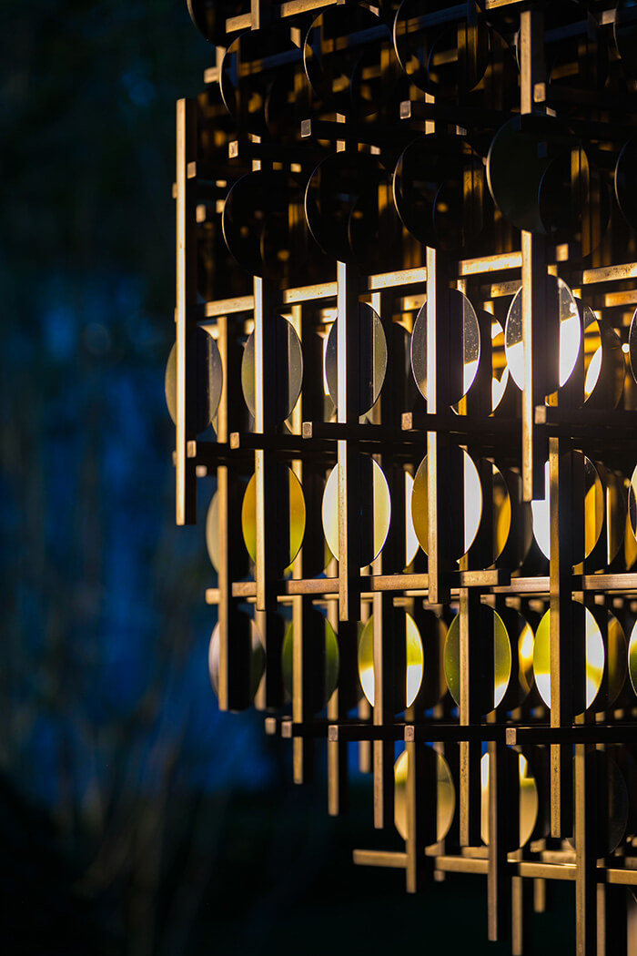
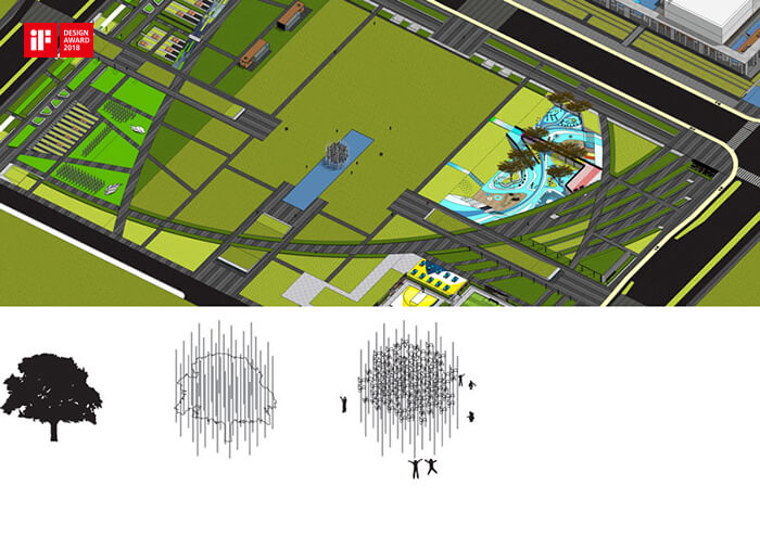
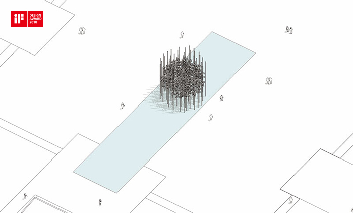
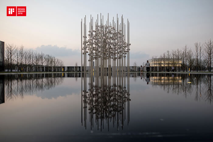
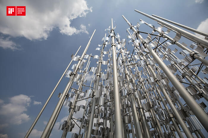
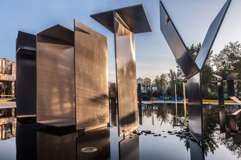
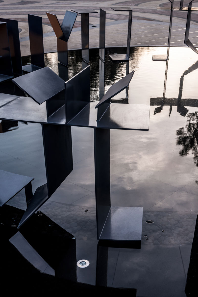
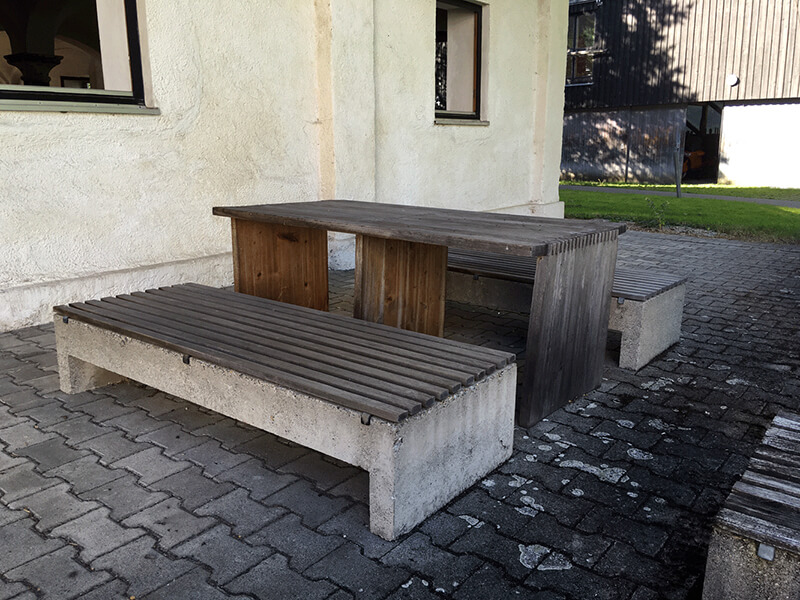
Modular Outdoor Seating, 2009

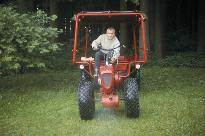
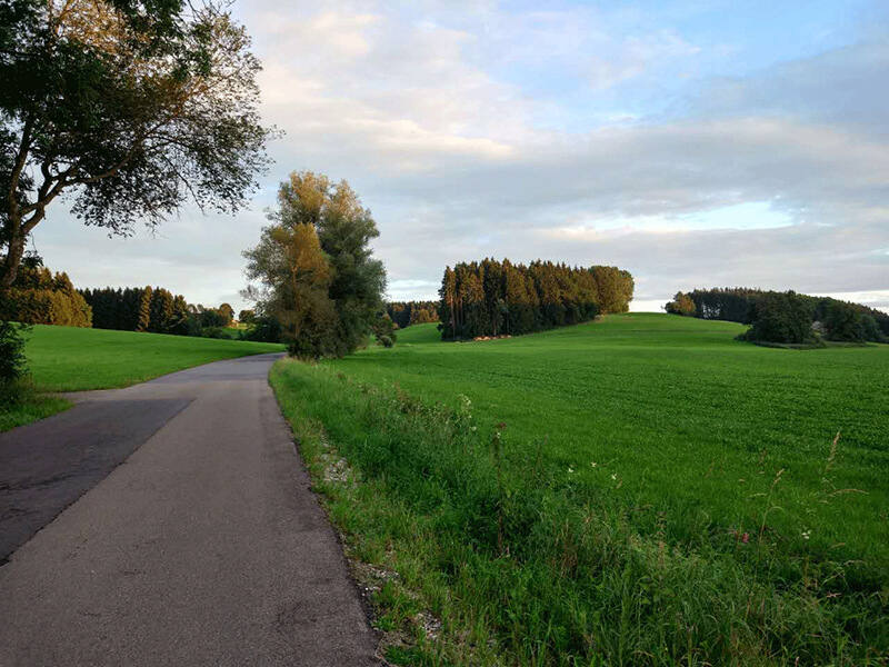
Aicher was compulsively strict with the tidiness of his lawn, and often mowed the grass on his own. On 26th August, 1991, he was struck by a motorcycle at the cross road while mowing, and died six days later due to the injury on his head on 1st September.


The cross road where the accident happened

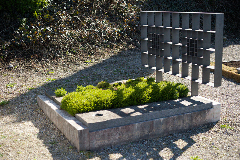
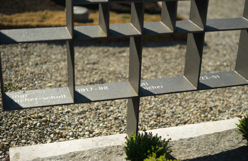
He was buried in the cemetery at Hofs Church near to Rotis. In 1998, his wife Inge Aicher was buried here next to him after she passed away.


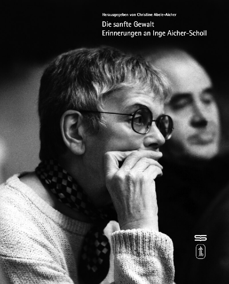
Inge Aicher is an exceptional educator and social activist.
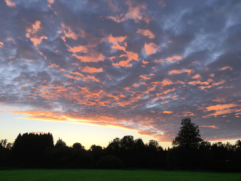
Rotis returned to quiet after Otl Aicher’s death, and the once design Utopia bowed out the design stage. Though the descendants of Aicher still lived here, big names or guests came no longer or less. Only the scene in the twilight remained splendid. 

In this common dusk, we had to set out to go home, and our exploration trip would also come to an end for this time. The golden sunglow changed silently, just as time flowing. I felt relieved when seeing this: isn’t this scene of silence and emptiness what Otl Aicher had been pursuing with his enthusiasm in his unsettled life?


Wish every one of us could find the final peace like Otl Aicher. Above is a designer’s tribute to the predecessor and his expectation of his unknown future. 
Thank you for reading. 
Some of the pictures are from the book Otl Aicher, published by PHAIDON, and some from Internet or Wechat shares.  

false

Twilight in Rotis 1

Rotis, yes, one of the most successful typefaces in the history of graphic design, is actually also the place where the font family was created. During 1986-1989, with the help of a large-scale computer, Otl Aicher and his team designed this typeface and named it after the domicile of Rotis where he lived and kept his studio. From then on, Rotis, originally a mill built in 1414, became a reference of design legend, and the design philosophy developed here is still influencing us.

Rotis on Google Maps
In 2016, on our summer holiday, we finally came to the place that we had been longing for: Rotis. It was located in Leutkirch im Allgäu, Southern Germany. After a long trip, we finally saw the six buildings of different scales hiding in the green grass and tall trees, peacefully. 

Legau, the small town near Rotis

A poetic road

A municipal road sign, Otl Aicher did not make any signs for himself.

Rotis that hiding in green
In the beautiful summer time that reflected through the red tiles and fresh green trees, the stable and the mill building present the classic architectural proportion with their big sloping roofs, while the other four buildings show modernism in precise scales. The overhead structure creates a combination of the void and the solid, showing the designer’s excel skills in designing modern buildings, especially the Bauhaus style jagged roofs: they echo the roofs of the mill building, at the same time, maintain the functions such as drainage, day lighting and pv power generation, making all the buildings integrate as a whole.

The stone that marks the establishment of the mill, in the year of 1414

1525 was also the year Martin Luther lead the Protestant Reformation.

The studio for the design team, now is a private house.

The garage, Otl Aicher’s office is on the second floor.

The stairs look like a time tunnel

The layout of Rotis

The river that once drove the mill had been rechanneled; all we see now is the lonely sluice。

The sundial once stood on the grass is now laid in the corner of storage.
Aicher was born in 1922, and he was a classmate and friend of Werner Scholl, and through him met Werner’s family, including his siblings Hans and Sophie Scholl, both of whom would be executed in 1943 for their membership in the White Rose resistance movement in Nazi Germany. Like the Scholls, Aicher was strongly opposed to the Nazi movement. He was arrested in 1937 for refusing to join the Hitler Youth, and consequently he was failed on his college entrance examination in 1941. In 1952, he married Inge Scholl, the elder sister of the Scholls. 

The Scholls, Sophie Scholl and Hans Scholl
The Scholls are regarded the national heroes of Germany. The memorial in front of the main building of the University of Munich depicts the leaflets they distributed. The Oscar Nominated Best Foreign film Sophie Scholl also mentioned Otl Aicher 

A photograph from the film Sophie Scholl
In 1946, Otl Aicher and Inge Scholl founded Ulmer Volkshochschul (VH Ulm) to carry on Hans and Sophie’s spirit and to promote the humanistic rebuilding of Germany with the commitment to the participants to help shape the political, social, cultural and social life of their city. Aicher helped design many promotional posters for VH Ulm through extensive social research, and it was when he found his potential and inspiration in visual perception and aesthetic exploration. After finding the best way to express himself, he turned to design and made it his lifelong career. One finds him/herself in the process of design - Die welt als entwurf, Otl Aicher.

The Otl Aichers (from left, the first and the second) walking in the free Germany after World War II

The posters Aicher designed for VH Ulm
The achievements of Otl Aicher:
1. He founded HfG after the World War II. It inherited the spirit of Bauhaus, and repositioned itself to be centered on humanistic education for the good of the whole society, blueprinting the development of industrial design after the War. However in 1968, Otl Aicher closed the design school himself in 1968, after a voting. 

The photo of early HfG, with the background of his favorite hanging shelf

Aicher was heavily involved in corporate branding and designed the logo for German airline Lufthansa in 1969.
2. Otl Aicher was asked by the organizers to lead the design for the 1972 Summer Olympics in Munich. The team developed a concept of rainbow that depicting the image of Germany as: free, domestic, and open. The set of pictogram design set a foundation for modern Olympics’ comprehensive public information system. The pictograms were featured in a series of grid, making the system simple, distinct and precise in structure. (I still remember how I was astonished when I first saw this system in 1980s.) After the Munich Olympic Games, the pictogram system was implemented in airports, train station and other public areas in Munich, and it is used around the world now. Public information system became an indispensable functional part in modern city. 

Posters for 1972 Olympics 

From the design of Olympics in 1964, 1968 and 1972, you can see the transition of aesthetic concept from art to design, therefore you find the significant role that Otl Aicher played in design field.

The design of Munich Airport

Signage design of Frankfurt Airport

3. After the Munich Olympics, Otl Aicher moved his studio to Rotis, and created brand and product designs for many international corporations and events there in Rotis. In 1989, Aicher accomplished the design of a typeface and named it after Rotis. The elegant Rotis font family changes with the rhythm of handwriting and developed to a highly unified yet varied typeface family that ranges from full serif, semi-serif, sans, and semi-sans, becoming one of the rare typefaces that can change freely between the tile and body of articles. Rotis is widely used in German public information system as a national font such as: Berlin public signage, Red Dot Design Award and so on. As computer design was increasingly used, Macintosh selected Rotis as one of its fonts. Therefore, the designers were given the access to Rotis finally. 

To be continued 

false

从包豪斯到乌尔姆

设计寻根之旅分享会

日前,由图石设计公司主办的“从包豪斯到乌尔姆”设计寻根之旅分享会,以及图石新年挂历的发布活动在方家胡同猜火车餐厅隆重举行。

万科、龙湖、远洋、中建等地产企业的设计管理团队,中国院、电子院、UDe、MAT、奇舍建筑等建筑设计单位,视域、无声、墨斗鱼、青岛视觉艺术中心等众多设计机构,以及AT建筑技艺、匠人客听等网络专业媒体机构的业界同仁共90多人悉数到场出席。

在近三个小时活动中,图石设计公司设计总监何杨讲述了此次前往德国领取红点设计奖、探访包豪斯、乌尔姆等设计历史故地的旅行经历,分享了旅途中的趣闻轶事,引起了与会同仁的热烈反响,演讲本身也被大家形象地称为包豪斯旅行攻略。而在根据旅行经历编辑的新年挂历中,因“情节”需要而频繁出境的何杨,更是被大家戏称为包豪斯形象代言人。

长期以来,图石设计一直坚持专业导向,在众多项目的设计实践中孜孜以求,秉持设计理想和人文立场,与此同时,图石设计也通过自己的专业态度与敬业精神,与各级专业机构建立了良好的合作关系,在此我们对合作伙伴们表示衷心的感谢!

展望未来,我们愿与各位业界同仁携手,立足于当下的社会现实与文化环境,跬步千里,努力去改善与提升城市环境的品质,创造更舒适、更人性的环境体验。


false

万科“旭庭”现身红点之夜

2015年11月6日,德国红点设计奖颁奖大典在柏林音乐厅举行,北京图石设计公司的作品“万科森林公园‘旭庭’品牌形象与环境导示”获红点传达设计奖,设计总监何杨、设计师刘文波、项目经理郭丽芳出席颁奖典礼,获奖作品于柏林设计师之夜现场展示。


2015年度共有来自53个国家7451件作品参赛,我们的作品再次脱颖而出,荣膺奖项。借此机会,我们特将获奖案例的部分内容提供给大家分享,因为整个工程还在分阶段的施工中,所以未来还会有更加精彩的实施效果逐步呈现。


背景:“旭庭”是合肥万科森林公园大区当中的B2住宅地块,它的景观设计以含蓄幽深、错落有致的庭院山水为主轴,将园林景观融入居住区的空间组织中,从而呈现出虚实相间、层次丰富的景观意趣。


品牌形象从字体设计出发,以现代的设计风格表现传统的韵致,在多维度的转换之间,微妙地传达出曲径通幽的景观感受,以及由此生发出的品牌价值。


在景观入口的节点,品牌形象化身成为小品式的对景雕塑,在视线的游走之间,构成引人入胜的一幕。


玲珑剔透的结构构成意趣,保持了品牌形象在空间中的完整形态,同时也照顾到在动线中的各个视角的品牌辨识度。


环境导示设计以“盒子”的形态为基本型,在系统的延展中强调了材料与构造的本质属性,以及简单明确的力学逻辑,这种中性的工业化的形态,在景观中反衬出了自然的体验。


false

专业培训活动在各地巡回开展

2014年七月至十月间,由图石设计公司策划并协同万科、绿地、龙湖等地产公司的设计管理部门分别组织的系列培训活动,在北京、上海、合肥等地巡回开展。活动以孙武等资深设计师编撰的专业培训课件《O!SIGN》为核心,对环境导示专业的学科内容与发展现状作了全面的梳理与阐述,并结合图石的设计实践,展现了环境导示的专业价值,受到各地与会设计同仁的高度评价,并促进了大家环境导示专业的了解与认知,起到了对本专业的宣传与推广作用。


false

天津美术馆获2013德国红点奖

天津美术馆天津美术馆导示系统在纯净的空间里使用了简单的“盒子”造型,并在盒子内部设置“内容”部分,利用多重透明效果传递丰富的视觉关系,独特的字体与版面设计,体现出现代建筑环境冷静与理性的精神气质,同时3 form 可再生磨砂材料的选用也展示了天津美术馆低碳环保的意识。作品无论从创新、美感、环保或是功能等各方面均有杰出表现,获得了红点评委们的一致青睐。

The Tianjin Art Museum, a landmark of the city of Tianjin, is one of the most modern museums in China. Stressing its architectural purism, the signage design uses simple boxes, with the idea of creating transparency and setting clear priorities in these public spaces. The special font used on the boxes fits well with the atmosphere of this modern art museum. For ecological purposes, the signage system was designed with a 3form Chroma renewable matte, as it helps reduce carbon consumption.


false

圆梦无需陪跑

图石作品再获两项德国iF设计奖

德国时间2016226日晚,iF 2016设计奖颁奖典礼于慕尼黑宝马世界隆重举行,来自全球超过5000件设计作品参加了此次设计大赛,中国大陆及港台地区共有13件传达设计类作品获奖,其中两件"万科曦园品牌与导示设计""2015建筑师挂历"为图石设计作品。颁奖典礼后,我们的作品将连同其它获奖作品一起在德国汉堡iF设计展中展出。

创立于1954年的德国iF设计奖,是全球最大也最受认可的设计奖项之一,被誉为“设计界的奥斯卡”。获得iF设计奖即拥有了国际公认的杰出设计标志,iF已经成为全球经济体系里设计关注者的一项重要指标。


2015建筑师挂历

我们从事的环境导示专业是设计空间信息(系统规划与视觉呈现)的专业,它的核心是将复杂的建筑与城市空间转化、简化成为抽象的信息,通过读取来帮助人们建立更有效的空间感。一直以来,我们也对另一个维度的信息设计有着兴趣,那就是时间的信息,而时间的虚无与抽象,也让它的视觉呈现充满扑朔迷离和不确定的可能,这一次我们选择了十二个建筑。从纵横交错的形体关系中找寻数字的具象,捕风捉影(有时也牵强附会),从而幻化成为12个以建筑表达的月份牌。当然这并不是真正意义的数字建筑,而且纯粹的现代主义建筑是不屑于任何外形肖似的,但在这里,我们利用这些建筑造型的偶然性,给挂历这样的时间信息带来了空间趣味,同时也希望能以专业精神不断地提示自己,导示工作的核心价值就是不断地帮助人们解读这些来自于现实世界的抽象信息。


万科曦园(品牌与环境导示设计)

曦园是合肥万科森林公园系列产品中的高端项目,场地景观采用万科开创的现代中式的造园理念,以东方传统的内向型的空间格局,打造街坊、巷陌、院落等多重外部空间,在公共性的开敞共享与私密性的含蓄内敛之间,营建丰富、精致、细腻的空间层次。点缀在景观动线中的导示设施简约凝炼、卓然而立,恰如其分地点染着景观氛围,并通过形体的虚实变化融入环境之中。设置在景墙上的、由书法家孙文题写的景观主题,宛如棋局中的气眼,点睛提气,意韵深长,有效地传递出素淡清幽的园林之美。


false

胡同里的办公空间改造

Space Management: Rooms in a Box

东城区方家胡同46号院是一个充满历史记忆的创意办公园区,包括图石设计在内的众多设计、文创企业在此注册办公。2015年九、十月间,图石设计对原工厂办公楼的4个办公隔间进行了装修改造,使其更适合于自己的使用。原建筑结构为上世纪八十年代营建的框架混合式结构,设计师拆除了部分轻质隔墙,联通了其中的四个开间。

设计工作是一种以思想观念创造价值的劳动,而营造轻松愉快、自由交融的工作氛围将有利于思想观念的产生与工作效率的提升,图石的办公空间正是以此为目的而展开设计的。

设计师把联通后的整个空间视作一个承载大家日常作息的开放空间,力保流畅的自然通风与采光,而把使用频率较高的一些琐碎的附属功能,如卫生间、打印间、水吧间、衣橱、储藏柜、休息间,统统整合进一个长方体内,并以“盒中盒”的形态置于整个空间的内侧,盒子以外的空间,则是设计团队灵活组合与沟通协作的工作空间。这就好像高层写字楼的平面布置方式,集合机电、空调、给排水、交通井等功能的核心筒设置在建筑中间,而办公区域围绕在核心筒四周分布。


为了强调两个不同属性空间的穿插对比关系,在色彩的处理上采用了黑白灰的方式,这个多功能的长方体化身成为空间中的主角—黑盒子。


办公工位沿着黑盒子形成的线性空间平铺展开,使得工位上的每个人起身前往黑盒子的动线最短。设计师在此营造了一个有趣的空间格局,看似简洁单纯的黑盒子,实际上是集成多项功能的Living Box,而在它外面的白盒子,则是充满机动性的工作空间,它的使用功能却是单一的。


利用水吧吧台的水平长度开洞而成的一扇带状长窗,增强了黑盒子空间的外向性,不仅丰富了公共走廊的墙面,也为整个办公空间未来的拓展设想了一种镜像的可能性。

对节点的控制以及精巧的细部设计使得整个空间充满了有趣和生动的细节,例如具有胡同特点的门牌号,以及迫不得已利用消防栓箱改造的招牌,都使得入口空间极富戏剧性。铜门上的空箭头与玻璃门上的铜箭头虚实呼应,构建出具有导示专业特点的空间意向。


改造前的消防栓箱先入为主,占据着办公空间入口墙面


胡同风格的门牌号


改造后的消防栓箱兼职招牌,并以擦边规范的方式强化了其不可复制性


元芳,你怎么看?大人,这个消防栓有蹊跷

直接印在桌面上的尺子让细部尺度的考量更加方便直观

卫生间温馨的角落

臣妾爱学习啊

梳妆镜连体纸巾盒

休息间里多功能的小茶几

Ulm Stool,坐在巨人的肩膀上换鞋

会议室兼做活动室与样品展示室

简洁、清晰的空间布局,黑白灰穿插的室内界面,充满旅途行进感的水平带状长窗,以及柯布沙发、Ulm Stool、Din字体等软装配饰,都显露出设计师浓浓的现代主义情结。最终,整个空间以比较好的施工完成度使得设计的价值得以实现。

项目:图石设计办公室

地址:北京市东城区方家胡同46号

客户:图石设计

设计单位:图石设计

设计师:刘文波、孙武、何杨

设计时间:2015.09

摄影:廖尚勇

false

融创中原壹号院

清水芙蓉 风雅壹宋

郑州东部的北龙湖片区被定位为城市发展的新引擎,城区总体规划讲求人文布局,空间格局有着强烈的传统气韵,甚至是对建筑风格,规划也提出了中式传统样式的要求。中原壹号院作为本区域住区产品的代表性作品,对建筑、景观、室内设计、环境视觉设计等专业都提出了高起点、高要求,而在各个专业之间,确实需要一个控制性的总体设计观念来统领全局,于是宋代美学风格成为大家的共识,力求在各个专业层面都表现出传承传统经典的设计价值。

宋代美学风格以其内在的人文精神为内核,表现着中国文人自魏晋以来,追求独立于世,畅想思接千载、万古如一的情怀,将此精神内核导入设计,希望对当代城市文化产生正面影响,包括理学、禅宗的社会理想与人生智慧,也将为现代人居环境带来积极的启示意义。


宋代的美学观念推崇典雅、平易的风格,以质朴的造型、清幽的色彩取胜,很少有繁缛的装饰,在文人意趣的引领下,全社会倡导一种清淡、理性之美,尤其是徽宗赵佶带领下的皇家画院出品的院画,对全社会有着广泛而深入的影响,院画形神并举,外师造化,中得心源,聚焦于超越时空的理想世界,并提倡诗、书、画、印结合,常以诗题、款识、签押、印章,装裱等构造画面空间,后人以徽宗年号称之为宣和装。这种强大的文化魅力,穿越时空,为后世的中国艺术,乃至整个东方世界的艺术格局创范垂统。


宋代文人推崇理学,理学言理而不言情,要求文思平淡自如,条达舒畅,并且院画所强调的谨细拟物与诗情画意并重的画风,也对同期的陶瓷、染织、建筑、家具等行业,以及人们的生活方式产生很大影响。因美术的介入,直接导致了宋代工艺美术逐渐脱离了实用性而向欣赏性发展,比如宋瓷,追求玉的精神,玉的美感,意向清水出芙蓉、君子比德如玉,很多西方学者尊称宋为瓷的时代。


视觉设计升华了“中原壹号院”案名所折射出的文化态度,奢华不再是简单的富贵豪华,而是基于深厚的文化内涵,用视觉设计提升项目整体的文化品格,而设计手法也并非简单的仿古摹古,而是以宋代风华作为设计驱动内核,参照理学、禅学的思想理念,结合极简主义的美学观念,构建“因为传统,所以现代”的当代设计表达。

外师造化,中得心源,郭熙《林泉高致》绘画与造园同理,景观设计师以画意造境,显示出不同于常规新中式的玄远高妙的境界。入口处的一挂虬松,引发马麟《静听松风图》的画意,弥漫着温润静谧之气,松清、泉曲、风高、山远,此旷达悠远之意,敢问画中人堪与谁会?或许只有石上清泉与风中虬松相对吧。

玉佩的青绿色有着鲜明的宋文化意象,使人联想起汝窑的天青色,青绿山水的石青石绿,这种清新自然的审美趣味,在宋代的文人士大夫与平民世俗间有着广泛的共识,后世曾有诗云:纵有家产万贯,不如汝窑一片。

“壹”字的结构化身为玉佩的完形形成主视觉的基本型,并以严整的建筑感来表达了一种昂扬向上、追求卓越的时代精神,同时通过视觉元素渐变的处理,描绘了一幅江帆楼阁,溪山清远的文化意境,而这正是“壹”所蕴含的文人逸致:思接千载,万古如一。


设计节点与它周边的场域存在着一种类似图底关系的组织性,二者互相补充,互为参照,从主视觉中提炼的图案阵列成肌理,铺展、弥散在环境中,形成视觉的场域,与设计节点一同构成完整的视觉生态聚落。而作为在建筑、景观环境中使用的主视觉Logo,强调它的“点”的属性,那么它与线、面、体等其它设计元素的组合关系将越简单、空间关系越明确,形式感越完整。


文化内涵与设计表达的统一,为环境的营造出一种知性的景观体验,钤印、落款、花押、题跋、笔墨等文人雅趣的设计元素,看似不经意间散布于空间中,实则由一种诗意的组织性连贯起来,使得场所精神在视觉系统的任何一个节点上见微知著,举重若轻。


宋徽宗在位期间,于汴京宫城的东北隅,营建的艮岳寿山,在园林掇山方面称得上集大成者,可谓“括天下之美,藏古今之胜”。据记载,此园冈连阜属,东西相望,前后相续,左山而右水,后溪而旁垄,连绵而弥满,吞山而怀谷。园内植奇花美木,养珍禽异兽,构飞楼杰观,极尽奢华。当此园落成之后,宋徽宗曾亲写《御制艮岳记》,记载这一盛举。

环境视觉最后的聚焦点落在公共艺术的节点上,设计师选取了艮岳寿山里的祥龙石作为空间意向的来源,使用当代艺术语汇再现了奇石的神韵。


郑州城市新区的开发,北龙湖高端住区的建设,在地性文化资源的挖掘,都需要高品质的专业设计助力,而环境视觉专业则发挥着媒介的作用,提炼场所精神使之视觉化,让观众在视觉认知中完成对场所精神的感悟。

环境视觉是建筑景观之间的设计整合系统,将不同属性的空间环境整合成为一个认知的整体,使之具有统一的品牌识别。从主入口礼仪空间的凝重肃穆,到层次细腻的庭院空间,直至室内空间,动静相宜,层层递进,在环境视觉的帮助下建立完整的空间序列关系。

环境视觉中重要的组成部分是环境信息的表述系统,标识出景观入口、建筑楼栋号、单元号、门牌号,以及会所、院落名称等空间职能,完善了建筑环境的使用功能,提升了环境质量,是现代人居环境必须具备的基本职能之一。

环境视觉显现了建筑、景观等各专业所共同追寻的场所精神,以及项目推广所强调的的文化气质,提升了环境的文化张力,并以优秀的设计形成的话题标签,为项目引入流量,有利于品牌推广。


项目:融创中原壹号院
地址:河南郑州
客户:融创华北区域
设计管理:徐迈、王佳恩、高欣、王乐、闻振江
设计公司:图石设计
艺术指导:孙武
设计团队:孙武、刘文波、张琳娜、高金笑、张睿、蒋旭慧、张沛楠
其它设计专业:上海日清建筑设计有限公司、TOPO建筑环境设计公司、李玮珉建筑师事务所
打样配合:北京天天精艺标识
制作单位:武汉纵横制造
设计时间:2018.06
文字编撰:顾玉琴
摄影:何杨、张沛楠
感谢顺景园林提供文中图2、图14的使用权

false

万科宜昌理想城

项目:武汉万科宜昌理想城

地点:湖北宜昌

客户:武汉万科

景观设计:沃亚景观

图石设计在今年六月的时候接手了宜昌万科理想城项目。在整个项目中,图石设计都在强调万科大鱼、环境导示以及景观家具开放的,精巧的,充满细节的设计状态。透过场地上的这些设施,创造出高品质的,具有互动性,蕴含探索价值的环境。也为宜昌万科理想城提供了一个对场地文化感知的载体,让江峡文化有了一个鲜明的视觉化形象,创造出具有城市地标意义的节点。


false

北京万科翡翠公园

自由之路

万科翡翠公园位于北京的北七家别墅区,项目重现了大洋彼岸波士顿的城市景象,波士顿本土的建筑事务所在这里构建出了典型新英格兰式的社区,通过对比例、尺度、材料等要素的控制,使传统经典在这里延续,将典雅的波士顿情调引入社区生活当中。


01.导示系统
在翡翠公园的社区环境中,我们打造了一套具有典型新英格兰式的导示系统来和建筑环境产生联系,通过现代的、非传统的手法对传统部件进行组合,在传达环境信息的同时,恰如其分地表现出场所氛围。在亲人尺度下,营造出新英格兰式的典型场景,使之成为经典环境的重要组成部分。

02.环境文化系统--自由之路
作为美国的历史文化中心,波士顿曾站在美国独立战争的风口浪尖。美国人民争取独立走向自由的这段历史就镌刻在“自由之路”上。
“自由之路”是一条由红砖铺成的道路,起点始于美国最古老的波士顿公园,并将波士顿总共16处历史文化遗迹像珍珠项链般串联起来。漫步于“自由之路”,能够看到红袜队球场、哈佛大学等著名的城市节点。
为了加强翡翠公园与波士顿的联系,我们将自由之路的环境形象进行抽象提取,然后散布在社区道路中,使这里的居民在环境中构建起对波士顿的城市印象。
环绕社区的红砖路上,波士顿的城市节点通过蚀刻铜板的方式镶嵌在道路中,使“自由之路”的秩序也存在于这个社区环境里。在会所的休闲平台,我们通过石刻的方式植入了一个总结性的节点,可以更清晰地了解到波士顿城市和“自由之路”的全貌。


03.公共艺术-漂浮的方尖碑
方尖碑在常规认识中是纪念性的永恒象征,在远方的波士顿,它静伫于查尔斯镇的山丘之上,作为波士顿自由之路的终点,象征着波士顿人民独立自主的精神。
我们理解在社区中的这个方尖碑,是传递着场所精神的各个小节点的汇聚生长,凝结矗立于项目之上的一个显性场所象征。我们希望将原有建筑设计的石质方尖碑改造成为一个具有现代精神,呈现出公共艺术特点的精神图腾。24米高的方尖碑由底部的镜面不锈钢向上逐级穿孔,从底部镜面反射呈现出的虚幻向上渐渐过渡到实体,让经典与现代在此交融,在展现出经典环境中的人文底蕴的同时,也传递出社区现代的生活方式,显现出这个场地的独特价值。


项目:北京万科翡翠公园

地址: 北京市昌平区
客户:北京万科
设计管理:贾萌飞,刘西明
设计公司:图石设计
设计团队:何杨、张睿、张琳娜、高金笑、蒋旭慧
建筑单位:Ai +Architecture LLC.
制作单位:北京君昊标识
设计时间:2016.04
摄影:何杨 张睿


false

大连融创海逸长洲

守望大连湾的融创海逸长洲,依海而建,时刻享受着来自大海的眷顾,项目中庭抬高的水面,一眼望去,场地与大海仿佛没有了界限,让人与大海零距离。优质的地理条件为我们打开了思路,很快就确定了要为场地做一个与自然环境对话的设计主题--海语者,使用浪涛这一自然语言在海边颂读歌唱。

这个项目中,图石设计通过建立包含品牌、导示、环境家具、公共艺术的视觉系统设计,让“海语者”的这个概念得到充分展现,让场地上的设施由点及线,由线生面,系统全方位的展示出场地上的自然气质与自由气息。

自此,在大连的海边,伫立着一个海语者--融创海逸长洲,他将为每个探访者颂读大海,写意生活。


false

万科御玺滨江

The One

在接手武汉万科御玺滨江项目时,营销推广的品牌形象已经出街,已经形成了一定范围的传播与认知,颠覆性的改动在这样的前提条件下并非最好选择,所以我们决定在原设计基础上改造与优化。中式花窗的主形象得以保留,而基础元素的主次关系被重新梳理,使之更适合于建筑、景观环境的应用,并且通过调整汉字间架结构的疏密布局,形成似与不似之间的非确定性状态,以此化解原LOGO过于物质化的视觉表现,点染出中式景观藏与隐的审美意境,不露锋芒但内含乾坤,呈现从容素简的文化气质。


通过在万科御玺滨江的的环境中建立包含品牌、导示、公共艺术的视觉系统设计,为整个项目带来属于场地特有的现代东方气质,丰富的表达层次让场地精神得以充分展现,创造独特体验。

false

万科中央公园

Vanke Central Park

万科中央公园地处的合肥北城,是一片正在崛起的城市新区,如何在开放展示区里呈现出城市新区未来欣欣向荣的愿景,是本次设计任务的重中之重。我们利用风的特性,创造了一个具有独特视觉体验的大型风动装置-“风之树”,将项目的自然精神与文化内涵凝结成图腾,成为空旷场地上的景观对景与聚焦点,它为整个场地创造出庄重沉静又不失灵动的氛围,风拂树冠,枝叶光影交错,在精神上联结起中央公园大社区的各个部分,汇聚生长,也体现了人们在都市空间中寻求与自然和谐共生的人文精神。


Vanke Central Park is located in the rising North Hefei, a city in the middle of China. How to demonstrate the thriving vision of the new area was the main challenge of this project. We designed an installation for the open lawn area “The Tree of Wind” that shaped as a tree and driven by the wind, making it the totem extracted from its natural and cultural spirit.
The eye-catching installation creates a unique visual experience and a peaceful yet dynamic atmosphere, making it the highlight of the whole environment. The leaves react to the natural light when the wind rises, gather and grow, representing people’s pursuit to live harmoniously with nature within the city.


false

郑北一中

郑北一中学校是碧源集团联合郑州一中投资兴建的一所集小学、中学的全日制学校,位于郑州市惠济区碧源月湖社区内,占地100余亩,建筑面积近5万平方米,共设有36个教学班。图石设计从品牌形象入手,为学校构建了完整的视觉系统和校园文化系统。

false

郑州月湖公园

Luna Lake
今天我看见
[挪威]奥拉夫.赫格
今天我看见,
两个月亮,
一个新的,
一个旧的,
我很相信新月,
可我猜它是旧的.
如同这首美丽的小诗,月湖公园就是这样一个浪漫、充满灵气的城中公园,它拥有一个月形湖湾,为城市增添了些许灵动,寄托着人们美好的憧憬。我们以汉字“月”为视觉核心,表现出城市中的这一弯月形湖水弥漫渐变的色彩,传递出皎洁晶莹的湖湾感受。
Logo在公园里出现时,是通过磨砂树脂箱体内不同角度的色板组合构成的,均匀的蓝色板透过磨砂面呈现出丰富层次的变化效果,安静而美好。

导示设计与logo一脉相承,色板的数量和角度变化形成了各种生动的状态,有的如月牙初生,有的则是logo中蕴含的汉字“月”。它通体轻盈,传递出具有弥漫感的视觉效果。如梦似幻,犹如精灵般散落在月湖公园。


false

Vanke Forest Park Dawn Garden

Dawn Garden is a high-end residential project of China Vanke Co., Ltd. Its landscape design highlights the style of courtyard. The well-arranged hills and water create profound connotation, giving a scene of endless water and hills. Our inspiration for brand image design comes from the winding path at the entrance that leads to the secluded quiet place. Combining modern design and traditional culture, the 3-demensional brand imageat the entrance echoes the surrounding environment and landscape, acting as a small size decoration item at the same time. The signage design takes the shape of box, emphasizing the natural material and structure, as well as simple mechanic logic. Its industrial structure serves as a foil to the natural landscape.

false

Vanke Forest Park Dawngarden

Dawngarden is a high-end residency real estate project of Vanke Forest Park line. The landscape uses Modern Chinese Garden Style created by Vanke, incorporates Chinese traditional introvert space layout, to create layers of extrovert space with courtyards, lanes and streets. Between the open public and private statements, a subtle and delicate multi-dimensional space is created.

The signage facilities are simple, concise, elegant, dotted in the direction lines, perfectly decorate the environment by the visual changes. The theme on the wall written by Calligrapher Sunwen is the highlight, like the joint in Chinese Weichi game, effectively express the beauty of a Shanshui garden.

false

异字同构-文字的化合与结晶

同仁堂健康零号店导示设计

同仁堂健康是中国著名传统健康医药品牌,致力于中国传统保健医药的现代再研发与生产销售,同仁堂健康旗下的零号店是结合保健、药品、食疗的新型保健品零售店与服务体验场所,传统养生文化与现代医药技术在这里交融与碰撞,人们能够在这个充满洋为中用、古为今用的交汇空间里获得难忘的文化体验。

本设计以场所特殊的文化气质为出发点,结合功能动线的使用需求,反思传统文化内核在当代语境下的表现方式,如何既能再现传统,又不失当代性,使设计成为为现代人认知古老文化的连结性节点。


在当今多元文化的快速演变中,什么才是主流的、本源性的文化元素?我们希望能在设计中汲取并予以延续。文字,作为媒介用来表现文化与我们自身的关系,不仅是历史的方式,也是当今世界的普遍共识,而在这种文化习惯的自觉与不自觉中,我们需要重新认识今天的媒介并持续更新它。作为历史悠久的经典文化元素,文字的语义以及优美凝练的符号形态也激发了一个绝佳的创作机会,在形式的创新中再现与延续这种历史文化传统,成为本次设计的主要内在驱动。


如同同仁堂健康的产品理念:0.1g的极致(细化颗粒以利于消化吸收),文字设计也尝试先解构以后再重组,原有的分间布白、上下齐平的汉字结构被英文字母词组依势介入,带来文字语义与符号形态的嬗变,当不同的笔划元素最终以一种化合结晶的状态再次呈现在空间中的时候,文化、技术、传统、时代的交融、碰撞之意在此呼之欲出。字体设计特有的叙事感,在环境导示的基本功能之外,同时完成了场所精神的物化与视觉化。


漫步在空间中,一个个跳跃的文化结晶成为视线的聚焦亮点,极具穿透性,甚至在某种程度上,整个零号店的空间动线是凭借一个个结晶字体连贯展开的。形态纤巧的字体由精准的悬吊结构与笔划实体连接构成,这对加工工艺提出了较高的要求。高亮质感的金属材料的选择也与温暖柔和、质感丰富的室内设计相得益彰,尤其是与相当数量的设备设施、输送管线的材料质感协调呼应。


《说文解字》里这样表述文字:仓颉之初作书,盖依类象形,故谓之文。其后形声相益,即谓之字。文者,物象之本,字者,言孳乳而浸多。意思是说仓颉刚开始创造文字时,大都依照物体的形象来描摹,即象形字,所以称之为纹,此纹同文;之后用象形字为偏旁部首组合出会意字、形声字,形声相益,合体为字,就叫做字了。也就是说文是最初的象形字,字好象这些象形字所生的孩子,因为字的本意是怀孕生子,如待字闺中的字。而我们的设计将英文字母解构进汉字的的结构中,引申出新的含义,是否也可以被视作是古老文字所新生出的一个孩子呢?
从项目自身的文化特色中归纳、提炼出一系列的环境信息与场所精神的表述系统,兼具传统与时尚,形成的设计成果在空间序列中时断时续、若隐若现,和着室内缭绕的食疗香醇,共同汇聚成一首独特的空间交响。

项目:北京同仁堂健康零号店
地址:北京大兴
客户:北京同仁堂健康药业股份有限公司
设计公司:图石设计
艺术指导:孙武
设计团队:孙武、张睿、乐毅、蒋旭慧、张沛楠、李雨菡
打样配合:北京天天精艺广告设计制作有限公司
制作单位:北京汉华轩国际标识制品有限公司
设计时间:2018.03
摄影:何杨、张沛楠
感谢北京无象空间建筑设计有限公司提供项目现场图片使用权

false

Central Times

Central Time

Project : Central Times

Address : Luohu,Shenzhen

Client : China Merchants Shekou Holdings

Architectural : office ma

Landscape : Woods Bagot (Beijing)

China Merchants Central is located in the industrial zone of Luohu District, Shenzhen. It was originally a Sungang warehouse logistics center. It is a commercial complex including commercial, office, apartment and other supporting spaces. It is the first old-fashioned project in the region and is expected to become an old regional reform. Benchmarking, reshaping the regional image. There are good natural landscape resources around, and convenient transportation links.

Architectural, landscape, interior and other design inspirations not only reflect the attributes of a high-quality office and commercial complex, but also incorporate the historical memory of the project.


false

Vanke City Lights

Vanke City Lights is located in Tongzhou New Town of Beijing. As an emerging district, Tongzhou New Town combines modern logical elements with its traditional context, striving to build a city shining with light of humanity.an open community, is where Tongzhou New Town is future highlights. The signage design, on the one hand, acts as a public function of city guiding; on the other hand, is committed to visualize the future of Tongzhou New Town. In virtue of the modular and intensive s forms spliced by modern architectures, the essential attributes and simple mechanical logic of material and structure are revealed easily.They serves as the medium of people and the envirinment, making the signage open and transparent. "I intend to find the transparency when using opacue materials, not the transparency inphysic, but something that be achived through graphic organizing "

false

Lake Songhua Resort - Prince Hotel

Prince Hotel is a five-star hotel in Lake Songhua Resort, run by The Seibu, and is the largest hotel for ski resort in China. It has an open hall, spacious guest room, and restaurants and ball room offer various types of foods. It has convenient connection between the ski service center of the hotel and the ski field, as well as well-equipped facilities. The architecture and decoration of the hotel is understated with high prestige. Signage design employed the natural element and quality of wood in the design body, and incorporated red cooper to form contrast, which showed the subtle relations of signage system with architecture environment.

false

Lake Songhua Resort

The signage system of Lake Songhua Resort has four key elements: consistency, incorporation, nature and tonality.

Consistency / The design form and choice of material of signage design extended the design concept and form of the architecture and landscape – North American mountain style. All the directory signs, identity signs and publication signs all employ the same design style, color, material, construction, logo and font.

Incorporation / The consistent signage system is designed to incorporate different attributes of the space and environment in the whole area, and build a continuous and unified environment experience of Lake Songhua brand.

Nature / The environment of Songhua Town, ski field and Prince Hotel is a natural combination of simplicity and delicate design form, with usage of local material like stone, wood, steel and other metals, and well-processed craftsmanship.

Tonality / The inspiration of architecture and landscape design, including signage design in Songhua Town and ski field is all from the simplicity of mountain nature. The picturesque and exotic shopping street creates spectacular holiday experience. People take pictures in front of the logo tower. Signage system has become the witness of tourists’ happy time here.

false

China Digital Manor

China Digital Manor is the office base of Sino-i Technology Limited. As a digital service base, China Digital Manor shows a strong sense of creativity. Our signage design “talks” to the building and environment by remaining the style and characteristic of the architectures. The signage successfully reflects the culture of the digital information era and establishes a clear space identity system, forming an ordered creative space together with the buildings.


false

Tianjin Art Museum

The Tianjin Art Museum, a landmark of the city of Tianjin, is one of the most modern museums in China. Stressing its architectural purism, the signage design uses simple boxes, with the idea of creating transparency and setting clear priorities in these public spaces. The special font used on the boxes fits well with the atmosphere of this modern art museum. For ecological purposes, the signage system was designed with a 3form Chroma renewable matte, as it helps reduce carbon consumption.


false

Greenland Center Zhengzhou

Greenland Group has formed a new business development model by developing super high-rise city complexes, which has become its core competitive advantage. In the next several years, its super high-rises will soon appear in first and second tier cities in China. Zheng Zhou is the most important traffic central in mid-China. Greenland Center is located in the core traffic central of Zheng Zhou, where the Speed Train Station, Subway Station and City Speed Train Station intersect. Greenland Center hence becomes the center of the area, even the center of the city.

Among many super high-rises Greenland Group has developed, Zheng Zhou Greenland Center is a big one. Designed by famous German firm GMP, two towers with 300 meters height and 800,000 square meters space, use tangled body structure, which forms an exquisite, light and dynamic outlook. Its soft windmill arc shape together with the overlapped architecture element makes the whole building graceful and crystal. Meanwhile, it’s the highest twin-tower and the largest super high-rise.


false

National Library of China

Highlighting the profound history and culture, ancient scroll books are attractive because of its smart binding that makes the books simple yet elegant.

The signage system, which is based on modern industrial technology, fully absorbs the charm of Chinese ancient scroll books. It therefore, reveals deeper cultural connotations, reflecting the historical context of the National Library of China.

What’s more, the scroll books are bound through treads, illustrating how the achievements of civilization are collected. It implies that National Library is where the human culture is reserved.


false

Mandarin Court

The uprising and straight building of Mandarin Court shows a firm and magnificent manner. Adopting the concept of uncut jade and knitting texture, we create a naturally integrated effect of Eastern and Western artistic mood. Affected by straight-line design, the façade emphasizes the characters of tall, steep and clean cutting. What’s more, long lines and typical decoration language scattering layout are widely used in many ways.

The signage design emphasizes the extension of the building’s structure. The elements formed by lines also show a decorative feature, which echoes the building structure. The metal trays deliver an uprising spirit, while all the materials demonstrate high quality, elegant gloss.


false

Chanba National Wetland Park

Xian Chanba National Wetland Park is the first national wetland protection project in northwest China. It locates in the intersection of Bahe River waterfront landscape belt and Weihe waterfront landscape belt, with an area of 5.81 square kilometers, is dedicated to reconstructing the land, show casing the eco-protection education and offering a space of public recreation.

During the on-site visit, a speech from one of the administration officer, encouraged us to transform the signage system into “ecology class”, with the hope to turn the place into a classroom where the public receive ecology education and learn modesty and feel awe in front of the power of nature. We use wood and simple structure to create a system of “blackboard”, with free and imaginative design expression, which has touched everyone, except for the officer of course… The interesting and vivid kid illustration and drawings are from Zhu Xinlin, whom we are heartily thankful.

false

ZED Pavilion in Shanghai Expo

The ZED Pavilion in Shanghai expo is designed by ZED Factory from London. It is the only zero carbon emission public building in China.We were appointed by ZED Pavilion to create a signage system for its whole space. The challenge of this task was to make use of the most common and even rough materials to create and make them look good. Thus, our designers chose old clothes hangers, jeans and t-shirts. This method reduced the production cost, also achieved the idea that real low carbon lifestyle is not achieved in complicated scientific theories, but in everyday life.


false

Longfor MOCO Center

Longfor MOCO Center, located in the heart of Chongqing Jiangbei District, is the landmark of this area. The center covers a total construction area of about 160,000 sq. m, with the main sightseeing avenue of the city crossing it in the center.

Referring to the geographical features and urban context of Chongqing, the buildings adopt the concept of drapes that highlight characters of mountains. The signage design carries on the concept of drapes, keeping constant with the architectures. It also emphasizes the deep commercial entrance through winding shapes.


false

Shanghai Citta di OCT Pujiang

As a demonstration area of central city of Pujiang, Citta di OCT PuJiang covers an area of 2 square kilometers. Citta di OCT PuJiang mirrors the mixed yet independent space characters of Italian cities. All the buildings are 2-4 stores tall, except one 11-storey building. The sidewalks and bike paths are integrated into the city garden which is an open one amidst the neighboring buildings. That actually keeps the cars outside.

The calm and rational attributes of modern architecture language, and the clear theme and spirit of the space set by the architect has offered guidelines and framework for the design of other disciplines.


false

Huzhou Ishine Plaza

Ishine Plaza is a plaza funded by Huzhou Aishan Plaza Construction & Investment Co., Ltd.. It covers an area of 18.97 hectares, stretching from the Hongqi Road to the Tiaoxi Road.

The plaza is located in Huzhou, an ancient city on the south bank of Taihu Lake, abundant with "Taihu Stone". Our design is centered on the stone, with various creative pierced holes.

To realize the sustainable design concept, the waste material produced from the punch of the 5mm steel is used as indoor signage material, which also naturally establishes a change between yin and yang, virtual and real effects, through the changes from outdoor to indoor space.


false

Forte W.Rongxian Hutong

The design makes full use of its location advantages and unique landscape resources, highlights its integration with the urban. Themed Looking for the Hutong Memory, the Hutong has a strong local culture. The tile roof and wood color frame create a deep atmosphere and tone courtyard tone. The enclosed and open walls form an interesting flowing space, delivering the tranquil and warm mood of the Hutong.

false

Greenland Garden Mansion

Greenland Garden Mansion is west to Shanghai University, with a total construction area of about 350,000 square meters. The villas, Western houses and apartments make it a large-scale comprehensive community and a landmark of its area. The buildings mainly adopt Art Deco approach.

The signage is a redesign to the classic North America grassland style. The change of density, the foundation of the design, together with the precisely produced metal compounds, makes the signage system a complete system which highlights elegant decoration details.


false

Eastern San Jose,Dalian Yida

Invested by Yida Group, Eastern SunJose is located at the intersection of the Dalian Software Park, the High-Tech Park, the Southwest University District and the Xinghai Bay Tourism Landscape District. With unbroken mountain lines to the north, the building commands a full view of the Xinghai Bay. our design is based on the representative signs in Art Deco Master Charles Rennie Mackintosh’s works. The combination of geometries and metal parts helped create a high-quality holistic system with elegant décor details.. In 2010, the selected works of Japanese wayfinding design album "the Way of Sign".

false

图石画册

图石的设计团队经过了十多年的发展,成功地实践了众多优秀的设计案例。我们从众多案例资料中提取一部分优秀案例,集成为图石的作品图册。书籍的整体设计概念意向一个多级空间嵌套的白色盒子,使阅读成为探究空间层次的趣味活动。

出品:图石设计

Production: ToThree Design

纸张:180克亚铜纸

Paper: 180g Matt art paper

画幅:150x210mm

Size: 150x210mm

工艺:四色胶印、PVC封套

Technique: Four color printing & PVC seal

false

图石2017新年挂历

Calendar 2017

“对于斯卡帕的情感,就如迷一般的难以言喻,他的设计是一种令人神往的返魅。。。马克斯·韦伯认为现代化是一个“世界失魅”的过程,在这个过程中,工具理性逐步地消解世界的神性和超自然意义。然而相反的,在斯卡帕的建筑中,你会感受到他把一切意识的魔力与神性复活了,这种情感的执迷似乎体现在无处不在的让你竭嘶底里的细部中。将观者从漫不经心和闲散中唤醒,便是“返魅”的前提,也是实现“失魅中的返魅”之根本所在。你会在他的作品面前带有一种神性的景仰之情,驻足细查,凝神静思;通过沉浸于作品的情境中,来获得与作品的交流,并体验精神的愉悦与升华。”

节选自《细部之旅》作者June

"Max Weber thinks that modernization is a process of disenchantment, in which instrumental reasoning eliminates divinity and supernatural causes gradually. On the contrary, we found that Scarpa revives the magic and divinity, which are reflected in the ubiquitous details in his architectures. To arouse the visitors from idleness and unconcern is the precondition for re-enchantment. when standing in front of his works, you will feel awed of them, and cannot help perceiving and meditating, communicating with them though indulging in their aura; and feeling the joy and sublimation of spirit." by June.

“2017建筑诗挂历”的灵感与设计语言来自于拜占庭的建筑骑士-卡洛·斯卡帕,他的诗是以混凝土铸成的,《空间中流动的诗性》,这书名是对他最好的注解,“设计不是在寻找出一个解决方法,而是在解决中给予一个谜。” 斯卡帕一生的建筑实践始终贯穿着强烈的人文倾向与诗意气质。我们通过平面设计的方式,在纸本工艺的技术中传达出斯卡帕诗意的神韵。

出品:图石设计

Production: ToThree Design

印制:奇良海德

Printing: QL-Art

纸张:210克大地木浆纸

Paper: 210g wood pulp paper

工艺:专色胶印、击凸、模切

Technique: Spot color printing, embossment, die cutting

画幅:420x594mm

Size: 420x594mm

包装:纸质工业筒

Package: Paper industrial tube


false

图石2016新年挂历

Calendar 2016

设计师选择了十二个建筑,并从纵横交错的形体关系中找寻数字的具象,从而幻化成为12个以建筑表达的月份牌。当然这并不是真正意义的数字建筑,而且纯粹的现代主义建筑是不屑于任何外形肖似的,但在这里,我们利用这些建筑造型的偶然性,给挂历这样的时间信息带来了空间趣味。

出品:图石设计

Production: ToThree Design

纸张:220克特种环保纸

Paper: 210g Coated paper

画幅:190x300mm

Size: 190x300mm

工艺:专色胶印

Technique: Spot color printing


false

图石2015新年挂历

Calendar 2015

设计师选择了十二个建筑,并从纵横交错的形体关系中找寻数字的具象,从而幻化成为12个以建筑表达的月份牌。当然这并不是真正意义的数字建筑,而且纯粹的现代主义建筑是不屑于任何外形肖似的,但在这里,我们利用这些建筑造型的偶然性,给挂历这样的时间信息带来了空间趣味。

出品:图石设计

Production: ToThree Design

纸张:220克特种环保纸

Paper: 210g Coated paper

画幅:190x300mm

Size: 190x300mm

工艺:专色胶印

Technique: Spot color printing

false

武汉航发

项目:武汉航发项目

地点:湖北 武汉

规模:景观面积5.36万平方米 (包含屋顶及户外平台)

客户:中国建筑设计院有限公司

内容:办公建筑及酒店环境景观

时间: 2017-2018

项目位于机场附近,西侧有任凯湖,北侧东侧均为城市公园绿地,环境资源得天独厚,建筑布局形成东高西低层次错落的形态,形成将外部景观纳入园区的态势。景观力求营造一种自然生机的生态化景观氛围,与周边的环境资源呼应融合,形成一个鸟语花香生机勃勃的生态化、智能化的园区,项目传达出不同于传统城市办公空间的特质。


false

北京富豪酒店

项目:酒店改造项目

地点:北京

规模:7300平方米

客户:中国建筑设计院有限公司/一合建筑设计研究中心

内容:建筑改造周边景观方案设计

时间: 2017

项目位于北京王府井大街北端西侧,街区景观风貌良好,项目景观设计强化了场所地理位置的特殊性,以及与北京地缘文化的呼应关系,同时还保留了场所空间记忆性的景观元素。

false

农庄体验乐园

项目:华府农庄景观规划

地点:北京、顺义

规模:占地400

客户:伊泰华府

内容:高端别墅配套城市农庄,亲子、亲农体验

景观规划及设计深化

时间:2012年(部分建成)

结合场地资源构建的城市型亲子互动式的农庄。 农庄也是枫桥别墅区的一项高端配套服务项目。农庄为别墅区业主提供绿色蔬菜、马场、户外亲子运动游戏乐园、会所餐厅,露营、婚礼等多项服务。

false

北京枫桥别墅

项目:枫桥别墅景观改造

地点:北京、顺义

规模:占地6万平方米

客户:伊泰华府

内容:景观改造方案设计、扩初设计

时间: 2012

枫桥别墅,是顺义区内一处已建成的独栋别墅社区,该项目的建筑立面及景观环境需要整体改造设计。整体别墅风格定位是:美式乡村风格,入口与会所区域为赖特的草原风格。景观在中央区域设计的水系及公共绿地构成了别墅组团的共享后花园,同时也最大限度地拓展了私家花园的用地范围。

false

北京别墅私宅庭院

项目: 私家别墅庭院景观设计

地点: 北京、顺义

规模: 北侧下沉庭院+南侧入户庭院 790平方米 客户: 私人业主

内容: 景观概念方案、景观扩出、施工图

时间: 2016年竣工

项目为两栋独栋别墅合并而成的大庭院,设计的挑战是:主庭院在建筑的北侧而且是下沉式,围墙高度5-6米,且狭长。设计要除去高墙给人的压迫感,同时用丰富的空间打破狭长感。建立室内与庭院的互动关系。绿植有序而丰富。


false

万科大鱼

中国锦鲤

这是图石设计在最近完成的公共艺术项目,一条“跳动”的万科大鱼。

图石设计在今年六月的时候接手了宜昌万科理想城项目,我们选择了拥有美好寓意的鱼来作为“理想”的载体,以此构建场地精神。而十月份活跃在网络上的“中国锦鲤,仿佛是对物理世界中的这条万科大鱼做出的回应,他们都承载了人们对美好的想象与希望

中国宜昌是三峡的起点,大江山峡在此形成壮丽美景,而江鱼是其中的精灵,他们为江峡地区带来生气与活力。在中国文化中,鱼是一种图腾,中国民间俗语“年年有余”,取“鱼”与“余”的谐音,用鱼象征富足与美满,是人心目中“理想”的化身。


江峡文化是场地上主导的地理文化背景,景观设计以此为切入点,使用“宜昌古八景”为线索,在场地上塑造了“理想八景”。景观水系穿越整个理想城商街,与外围的景观种植条带在项目入口广场交汇,形成“西陵形胜”,这为万科大鱼的设置提供了绝佳的场地条件

为了确保商街的视线通达和动线的连续性,我们在装置设计上主张保持入口的打开状态,让艺术装置分立在入口两侧,保持通畅也强调了商街入口。大鱼装置由12mm厚的不锈钢板通过圆柱形钢棒连接而成,大鱼昂首翘尾,一跃而出,将入口广场的地面化作江潭。


机械转盘带动鱼头和鱼尾不停变化角度,金属面因为角度变化和时间推移呈现出不同的光感,形成在水面活灵活现的生动状态。


扁钢在角度变化中形成强烈的虚实变化,在场地中呈现不同的状态。在某些时刻,扁钢侧面正对视线,大鱼似乎在场地上“消失”。


鱼头装置开放的内部空间形成了一个休憩场地,两侧设置了座椅,缓缓转动的转盘和序列排布的分割钢板,为其中的休息者提供了一种对外界新的观察方式。


不时有人走入其中,驻足观看,叠加了夜间的色彩,又是不同的景致。

大鱼拥有丰富的细节,在近人尺度能感受到天光的变化,水面的反射,流动的阴影,如自然在其中写诗。


鱼头转盘中央的云朵机在特殊的节日会制造出各种形状的气泡团,气泡团从鱼嘴升起,为项目的商业气氛推波助澜。

在夏季炎热时节,鱼头装置顶部的喷淋开启为空气降温,带来丝丝凉爽,也让大鱼有了吐纳的气息。

进入夜晚,大鱼反射灯光,焕发日间完全不同的光彩,斑斓夺目。


在广场上,“跳动”的万科大鱼让场地充满新鲜感,不时有人停下来驻足观看或走进小憩,小朋友跑进跑出,围着大鱼转圈,不时被落到脸上的喷雾逗的咯咯笑,大鱼装置成为一个人气集聚点,在它身上能探索到不同的乐趣。

让商街入口从城市界面中跳脱了出来的大鱼,吸引着来自城市的好奇心,营造出充满人气的商业氛围,也将宜昌这座城市的地理文化—江峡胜境在城市中用现代方式得以展现,成为城市文化对外传播的一个载体。

大鱼跃过江峡

在夷陵深处激荡起涟漪

扰动城市的水波

让人趋之若鹜一探究竟

这精灵昂首翘尾

口吐氤氲

那是理想在弥漫

……

false

海语者

大连融创海逸长洲

浪,是大海的语言。

以浪涛发声,是为海语者。

守望大连湾的融创海逸长洲,依海而建,时刻享受着来自大海的眷顾,项目中庭抬高的水面,一眼望去,场地与大海仿佛没有了界限,让人与大海零距离。优质的地理条件为我们打开了思路,很快就确定了要为场地做一个与自然环境对话的设计主题--海语者,使用浪涛这一自然语言在海边颂读歌唱。

由“海语者”生发出的公共艺术装置,以各种不同的表现方式出现在景观环境中,成为参观动线上的对景点,海语者的视觉语言在环境中演化生长,阐释场地主题


项目入口是一个由正方形屋顶和景墙围合形成的半开放空间,我们在这里构建了一组由双层铜片构成的环状装置,近6000块铜片被悬挂在直径8米的圆形骨架上,间隔排列的方式保证了视线的通透,也形成了海逸长洲独特的视觉语言。

环绕而行,双层铜片在移动中造成的视线撞网,让图景变幻,如叠叠浪花翻腾奔涌,海风拂来,铜片迎风而起,在光影的映衬下散发光芒。海语者的浪涛在此绽放,名曰:“观涛”看到了吗,那是大海捎来的讯息。


风雨连廊另一端头的石材墙面,被改造成为这条艺术动线上的一个节点凹刻于石材的Logo图形如惊涛拍岸,水落“石出”,和入口铜阵,一虚一实,相映成趣,同时也强化了这条艺术动线的完整性。


左拐直行,第二段风雨连廊的端头,菱形镜面在十字骨架上均质分布的小型装置设置于此虚实间隔形成与logo图形有关联的设计形态,人与自然的光影被散布的镜面映照其中,移步间又飘忽不见,时显时隐,引人“寻影”其中。


循路向前,站在会所门前,向样板区望去,球形装置随传动轴缓缓转动,圆形镜面扑光捉影,春风“化雨”,反射出时时不同的景象,为场地平添一份生动。

这种讲求序列排布,强调虚实对比的做法,源于Logo图形展现的设计关系。多层分布的基础要素通过视线移动或者自身转动在空间位置上的变化,让序列重组,同时反射周边环境,构建无穷形态,是海语者艺术装置系列表达的核心,海语浪涛的形态是自由而无穷尽的,通过设计让这种状态在人造的自然景观中得以再现,实现海语者的独特表达。


园区参观动线上的艺术装置,让整个场地高度统一海语者这一主题之下,大海的语言在此演绎自然的无限创造,几何图形在排布秩序间被注入了自然的灵魂,凝聚着海洋的神秘生命力,表达出更加意味深远的自然。

false

我的世界

郑北一中

学校是理想的摇篮,我们希望为孩子们创造一个放飞梦想、畅游世界的主题环境。一款孩子们非常喜爱的益智游戏Minecraft给了我们很多启发。在学校入口的水景中,我们设置了一颗像素地球缓缓转动,这个创造性的地球艺术勾勒出孩子们心目中的世界,描绘出小朋友们眼中的远方,也传递出学校朝气蓬勃,勇于探索的精神面貌。


false

汉江楚水化苍龙

万科御玺滨江艺术品设计
坐落于武汉长江西岸的“万科御玺滨江”,沉静内敛,奢而不喧,充满东方哲思意境,于都市生活中寻求一份大隐于市的心境。

在梳理场地精神的时候,御玺滨江这个名字让我们想到了盘踞在玉玺上的蛟龙,龙是中华民族的图腾,是中式文化的代表符号,显威严尊崇之气,滨临长江也让“龙”拥有地理上的背景。受此启发,“蛟龙潜匿隐苍波”成为场地上的艺术主题,龙作为一个显性视觉符号,被我们用“藏”的方式化解,呈现素简空间中的价值感与文化气质。

我们将“龙”设置在场地中央的核心位置--下沉庭院,取代了固有的“一石三山”的U型玻璃画面墙,希望能够打破新中式环境中固有的模式设置,在空间中创造更多有趣味的表达。山型化作千里波涛,化身为龙。

公共艺术装置用简纯的语素--相同大小,相同颜色的菱形铜板重叠排布,变化角度,呈现出不同的明暗关系,生成生动的图景。这种通过单一要素构建的丰富表达,是对项目素简但深厚的回应。在艺术装置中流转的自然要素,参与到场地叙事,带来生动灵气。


false

何曾见过风

万科中央公园艺术品设计

何曾见过风?

你我皆不曾

但看木叶舞枝头

便晓风穿过

何曾见过风?

你我皆不曾

但看万木垂梢首

便晓风吹过

-宫崎骏《起风了》

万科中央公园地处的合肥北城是一片正在崛起的城市新区,开区大片的公共绿地以及建设中的学校、社区中心、图书馆、商业等公共配套将达成城市功能的完善与升级,如何在开放展示区里呈现出城市新区未来欣欣向荣的愿景,是本次设计任务的重中之重。我们尝试在环境中建立整体的视觉体系,将“公园+学府“的项目品牌核心,渗透到从品牌形象、环境导示、公共艺术,直至景观家具、建筑首饰的每一处细部节点。而同时,我们利用风的特性,创造了一个具有独特视觉体验的大型风动装置-“风之树”,将项目的自然精神与文化内涵凝结成图腾,成为空旷场地上的景观对景与聚焦点。风之树为整个场地创造出庄重沉静又不失灵动的氛围。风拂树冠,枝叶光影交错,在精神上联结起中央公园大社区的各个部分,汇聚生长,也体现了人们在都市空间中寻求与自然和谐共生的人文精神。


与风之树对景的社区中心广场,则结合场地的精神气质与结构布局使用山、水语素,营造生动的气韵场,让人们在现实的社区环境中获得一份出世的精神慰藉。树为具象,山、水为意象,具象与抽象,形与意交相呼应,体现出超然的生活意境。建筑中心的圆形水池犹如泉眼,泉水从中央涌出,水波涟漪回荡在水景之中。与主体建筑的庄严肃穆形成动静对比,相映成趣。

false

城市的魔法指环

大连万科城市之光艺术品设计

城市之光的主题雕塑位于整个社区的城市入口,作为大型的公共艺术,它既建构出项目形象系统的完整性,也传达出万科品牌无微不至的公共情怀。

在直径七米的圆形空间中,灵动的景观水系与严整的、工业感的钢板字体围合出的造型,亦虚亦实,构建出极具写意的魔法指环,无论从任何一个角度观察,都是完美无缺的。而指环象征着美好的爱情,以及走向婚姻的誓言与盟约,带着对未来生活的这份期许,年轻的伴侣要在万科的家园构筑他们的爱巢。同时,这样一个艺术形象更代表着兢兢业业的万科人对城市及业主做出的一份郑重承诺。


false

Name Origin

“to three” is from the book “To Three” by Emerystudio. “to” is a pun, which conveys not only a directional movement, but here also shows the essence of graphic design for environmental information. “three” is not only the presentation of design outcome, but also the experience people get from the design. “to three” represents the expansion of design from graphic to three-dimension space, or even broader.

false

About us

To Three is a design, planning and technical service company in graphic & signage system. Our specialty is architecture and urban environment. The core design team has diverse professional background and rich experience in signage construction. After ten years working together, the team has integrated perfectly. With remarkable performance combining maturity and steadiness, the team had in charged or joined large scale public project, Such as Beijing Capital International Airport, Shanghai World Expo Exhibition and Convention Center and National Library of China etc. We also provided our service to well-known enterprise, Vanke, Longfor, Sino-Ocean, Greenland, Hongkong Land, and Shuion Land etc. Design scope covers large public construction, urban complex, urban service system, business center, high-end residential area and landscape design. Our projects have been published in domestic and foreign professional design magazine. We have also won the national ministries, and international and domestic of all kinds of design awards several times.


false

Work Experience

Awards
●2019, Sunac Dalian “The Sea Vibes” was awarded the Golden A’Design Award ;
●2019, Vanke Central Park “The One” was awarded iF Design Award;
●2018, Vanke Central Park “The Tree of Wind”and 2017 ARCH-Poetry Calendar was awarded iF Design Award;
●2017, Luna Lake Brand Identity & Signage Design won Red Dot Award;
●2016, Vanke Dawn Garden Brand Identity & Signage Design and 2015 Architects’Calendar was awarded iF Design Award;
●2015, Vanke Garden Dawn Brand Identity & Signage Design won Red Dot Award;
●2015, the signage design of Yizhuang Digital Land won Good Design Award;
●2013-2014, the signage system design for Tianjin Art Museum won iF Design Award, Red Dot Award and German Design Award;
●2010, the signage design for Eastern Sanjose and ZED Pavilion at Shanghai EXPO 2010 was selected in the book Way of  The Sign;
●2007, the brand VI design of Xiamen V-lion won best design of China Brand Yearbook;
●2005, Huashan Mountain signage design won Silver Award of “China Element – Visual Design Exhibition” held by Ministry of Culture of PRC ...

false

Design Services

Environment Graphic / Signage Design / Landspeac Design / Graphic Design / Public Art

false

Contact

Building C-1413 ,No.46 Fangjia hutong ,Beijing 100007

weibo.com / tothree

info@tothree.cn

QQ 329287178

T/F 86-10-8401-8358

Wechat:tothree


false

Licence

Licence

名称:北京图石空间创意设计有限公司

类型:有限责任公司(自然人投资或控股

住所:北京市东城区方家胡同46号4-1幢1413室

法定代表人:何杨

注册资本:100万元

成立日期:2013年07月31日

营业期限:2013年07月31日至2063年07月30日

经营范围:产品设计;电脑图文设计、制作;经济信息咨询;承办展览展示;设计、制作、代理、发布广告;市场调查;影视策划;摄影服务;销售工艺品、文化用品、电子产品、机械设备、日用品、建筑材料。